Old Wine in New Bottles
May 19th, 2008Posted by: Roger Pielke, Jr.
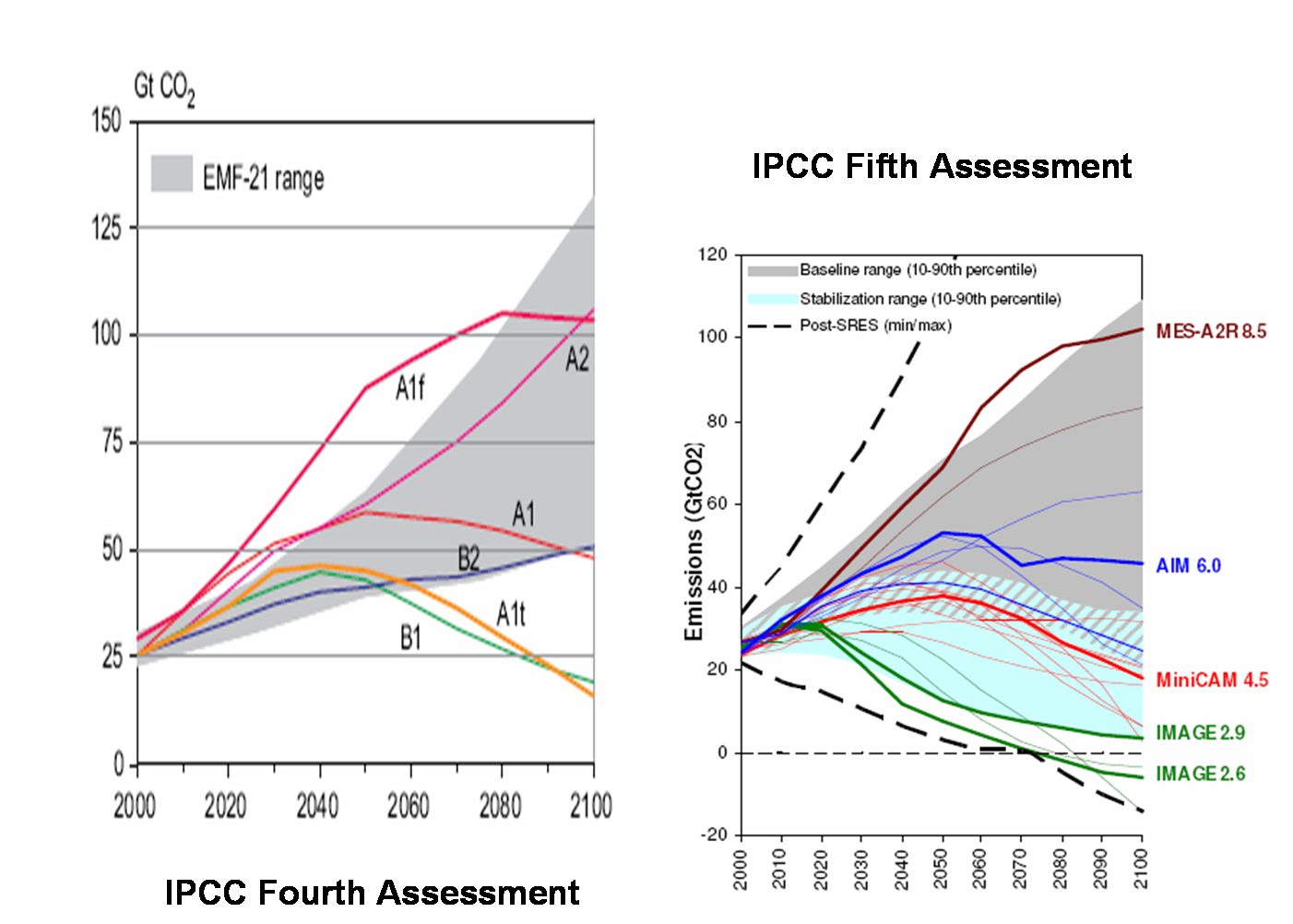
The IPCC will be using new scenarios for its future work, updating those produced in 2000, the so-called SRES scenarios. This would be good news, since, as we argued in Nature last month, the IPCC scenarios contain some dubious assumptions (PDF). But from the looks of it, it does not appear that much has changed, excpet the jargon. The figure below compares the new scenarios as presented in a report from a meeting of the IPCC held last month (source: PDF) with those from the 2000 IPCC SRES report. I have presented the two sets of scenarios on the same scale to facilitate comparison. Do they look much different to you?
May 18th, 2008 at 10:54 pm
Uh, yeah. Forgetting even the 132 page document describing the completely different approach taken in constructing the new scenarios, as you seem to do in this post, the new figure (on the right) includes clear mitigation scenarios and probabilistic ranges If you want to do a real comparison, how about reviewing the methods used to develop the scenarios, or at least comparing figures with the same y-axis?
May 19th, 2008 at 2:48 am
Simon, you’ve got a point, but still, if using a “completely different approach” when looking at the result “it does not appear that much has changed” one starts to wonder if the end-result wasn’t fixed in advanced.
Cheap shot? Well, no as we’ve seen too often by IPCC and its supporters that the end-conclusion is not to be a matter of debate. The science is settled, it is now up to politics etc.
May 19th, 2008 at 2:50 am
(Oops, sorry for double post. I got an error while posting.)
May 19th, 2008 at 7:50 am
Simon D-
Look again, they do have the same Y axis. Fortunately, the scenarios are taken from the literature, most of which are readily available (at least one has been hard to track down). And I would be happy to discuss particulars in future posts.
But despite the various details, so far at least, I see no evidence that the IPCC is not repeating the exact same mistake of rosy assumptions in its scenarios that we critiques in Nature last month.
May 19th, 2008 at 10:17 am
Hi Roger,
Once again (or did I ever send this in to your site?) I recommend you write a letter or paper to Nature or to Science stating that the IPCC scenario system is inherently flawed, and that the proper way to do the whole thing would be:
1) Estimate the probability distributions of emissions for each climate forcing agent separately (e.g., CO2, CH4, black carbon, SO2, organic carbon, etc.). That is, for each forcing agent, produce a 50 percent probability value, and a range that covers 90 percent of the possible values (i.e., a 5% probability less than value, and a 95% probability less than value),
2) Estimate probability distributions for the resulting atmospheric concentrations of all those forcing agents (for example, a given level of CO2 emissions could result in differing atmospheric concentrations depending whether CO2 sinks stayed the same, increased, or decreased),
3) Estimate the probability distributions for climate forcing for all of those individual atmospheric concentrations (in CO2 equivalents), and
4) Estimate probability distribution for climate sensitivity (I think this is the one thing that the IPCC has actually done), and
5) Come up with probability distributions for global surface temperature (and global tropospheric temperature, if different), and probability distributions for global sea level rise, etc.
I’d be happy to be a co-author with you (although it would probably hurt your chances of getting published). Heck, I’d be happy to write most of the letter/paper. This would be a very important letter/paper, because it would show everyone that there is an alternative to the IPCC’s unscientific and inappropriate scenario nonsense.
One important point, we would not have to say what we think the numbers should BE (other than perhaps as an illustration for one or two forcing agents…I like methane, for instance). We just need to be pointing out that the scenario method simply isn’t scientific. (I think everyone knows this, so I doubt even you could get it published, but I think it’s worth a shot.)
Best wishes,
Mark
May 19th, 2008 at 4:59 pm
Are we looking at the same figures? The y-axis on the FAR figure has a range of 0-150 Gt CO2. That of the 5th Assessment figure has a range from -20 – 120 Gt. If plotted on the same y-axis, the range of emissions scenarios would seem quite different.
What do you (and the other readers) propose the range of scenarios should look like? Is this not a case where it is far easier to criticize than to do the work?
May 19th, 2008 at 5:02 pm
Simon- I have tried to scale the figures so that the 0 and 100 levels on the y-axis correspond to each other, so that they are on the same scale. Not perfect, but pretty close.
We have done some work evaluating the scenarios, and if you want recommendations, I’d suggest starting here:
http://sciencepolicy.colorado.edu/admin/publication_files/resource-2594-2008.09.pdf