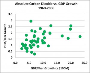
Comparing Annual Absolute Growth in Carbon Dioxide Concentrations with GDP
March 20th, 2009Posted by: Roger Pielke, Jr.
This is a follow up post, commenting on remarks made in Der Spiegel by Pep Canadell, CSRIO (translation courtesy B. Peiser):
According to Canadell, the global gross national product (GDP) was 2.5 percent last year, despite the onset of the economic crisis. But it was not as strong as in 2007 when global GDP grew by 3.2 percent. Accordingly, the energy consumption of industrialized and emerging countries actually declined in 2008 – and thus also the associated global carbon dioxide emissions. [...]
GCP’s experts are unable to explain the exact reason for this anomaly since they haven’t fully analysed the 2008 data yet. However, Canadell, by its own admission, cannot imagine that greenhouse gas emissions could have accelerated in spite of lower economic growth. The CSIRO-ecologist considers it more likely that natural carbon sinks are showing signs of exhaustion and are losing their ability to soak up emissions. [...]
To evaluate these comments, lets have a look at the relationship of global GDP growth and increasing carbon dioxide concentrations, 1960 to 2006. Carbon dioxide data from NOAA, and GDP from A. Maddison. The GDP data shows how much the global economy expanded in PPP-adjusted dollars, whereas the carbon dioxide shows the increasing in concentration in parts per million.
For 2007 and 2008, carbon dioxide increased by 2.2 and 1.7 ppm respectively, while corresponding GDP growth information is not yet available in the Maddison dataset. However, what should be clear from the historical data is that there is a wide range of concentration increases associated with different economic growth rates. This is to be expected, because not only is there variability in the ocean and land uptake, but there have been dramatic changes in the carbon intensity of energy and energy intensity of the economy have changed over time.
It seems quite premature, and even unjustified, to suggest the exhaustion of natural sinks, when the recent observations do not seem at all out of line with what has been seen previously.

March 20th, 2009 at 10:49 am
The CO2 growth axis mixes natural sources, natural sinks, and manmade emissions. There would be less scatter in the diagram if only CO2 emissions from energy use were plotted.
A second line chart could plot total CO2 in the atmosphere against CO2 from energy use.
March 20th, 2009 at 11:51 am
Looking at the individual NOAA numbers there is a very significant natural effect. If you could figure what causes the absorbtion to be weaker or stronger would be useful.
March 20th, 2009 at 2:11 pm
I plotted CO2 growth against year. There is a lot of scatter starting in the late ’70’s. Given that there is no way either GDP or enissions are going to correlate very well.
March 20th, 2009 at 4:55 pm
Here is a graph of CO2 global annual emission growth and Dow Jones annual growth
http://home.casema.nl/errenwijlens/co2/dji_emis.gif
I am waiting eagerly for the 2008/2009 emission figures.
March 21st, 2009 at 2:03 pm
The rate of ocean cooling/warming is a factor in atmospheric CO2 growth, as well as GDP growth rates.
http://wattsupwiththat.com/2009/03/21/recent-ocean-heat-and-mlo-co2-trends/
March 22nd, 2009 at 12:51 am
Roger,
Why did you compare the change in GDP to the change in CO2?
Even if the GDP did not change from year-to-year there should be an increase in CO2 which the increases getting larger as time goes on.
Didn’t you find that the later years all ended up on the top half of your plot?
March 22nd, 2009 at 6:57 am
Raven
There isn’t an even increase year to year. There is a lot of scatter.
March 22nd, 2009 at 1:11 pm
maurmike,
I realize that but I am confused about the X axis on the graph.
Is it the year by year increase in GDP or is it the total increase from a fixed baseline?
If it is the year by year increase in GDP then the graph does not make sense.
March 22nd, 2009 at 1:59 pm
Raven
I was speaking of a CO2 ppm /year growth versus 1959 to 2008. It looks like a shotgun blast of bird shot.