Archive for the ‘Scientific Assessments’ Category

Research Assessment is Expensive

December 21st, 2008

Posted by: admin

Researchers in the UK are in the midst of a periodic Research Assessment Exercise (RAE), which assesses how well the billions of pounds of government research funding have produced international quality research.  Nature News has the details.  In short, the government institutes a huge peer review of UK research, an effort that is costing 12 million pounds this time, more than twice the cost of the last RAE, conducted in 2001.  As a result of the skyrocketing costs, the UK government will institute a series of metrics (like citations) for the next assessment, scheduled for 2013.

While I think a peer review assessment would be more effective than less reliable metrics, I certainly understand the financial pressure.  Instituting something similar in the United States would be proportionately more expensive.  That said, the attempts at assessing federal research in the United States could benefit from a more systematic approach.  At the moment, the evaluations mandated by the Government Performance and Results Act do not seem to be as thorough as those conducted by the UK (or even those planned by the UK), and a stronger research assessment program would help defuse some arguments against various kinds of research – arguments like “what do we have to show for these billions of dollars?”

Public Understanding of Science Should Include Other Scientists

November 8th, 2008

Posted by: admin

Matthew Nisbet, a communications professor at American University and author of the Framing Science blog, noted recently a Policy Forum article in Science (subscription required) that showed something that is perhaps obvious, but bears emphasis.  The article described an experiment conducted at MIT where students with training in science or economics were given parts of the IPCC summary for policymakers on long term accumulation of carbon dioxide in the atmosphere.  Approximately two-thirds of those students were unable to accurately recreate the emissions path necessary to stabilize atmospheric carbon dioxide.  You can read more of Nisbet’s assessment on his blog.

What I take from this is a need to recognize that the ability to communicate scientific results clearly and properly not only requires an appropriate frame, but the public often considered in studies of the effective communication of science should also include other scientists.  Yes, this is probably an example of cross-disciplinary disconnection, but increasing specialization has been happening in science for a long time.  While it may be tough to bridge the gaps, it shouldn’t be a surprise that the gaps exist.  Just because scientists, in general, may be able to think and act in similar ways does not always translate to understanding across fields.  So, the next time you’d like to try and frame some of your research to a public audience, see how a scientist from another field understands you (or doesn’t).

Sloppy Work by the CCSP

August 5th, 2008

Posted by: Roger Pielke, Jr.

The Synthesis and Assessment Products (SAPs); of the United States Climate Change Science Program (CCSP) are supposed to represent the absolute best reviews of the state of climate science from the world-leading United States research enterprise. With more than $30 billion invested in climate research over the past two decades, the SAPs represent the most important summary documents in U.S. climate science. The CCSP explains the significance of these reports:

These reports will provide current evaluations of the identified science foundation that can be used for informing public debate, policy development, and operational decisions, and for defining and setting the future direction and priorities of the program.

An unprecedented process of review was established to keep political appointees far from the reports. However, the significance of the effort and the rigorous review has not been sufficient to result in a quality synthesis report, which in its release for public comment is marred not only by incomplete analysis and selective presentation of science, but also, by plain old sloppiness.

Consider these three examples:

1. Doctored Image. As first mentioned in the comments on this site by Mark Bahner, and shown conclusively by [UPDATED] a commenter at Climate Audit and further discussed by Anthony Watts the report contains a photoshopped image (above) of flood damage in a section discussing precipitation. Not long ago Andy Revkin in consultation with his editors at the New York Times removed a doctored photo of a “wall of coal” when shown to have been altered by Peabody Coal which provided the image — you’d think that the CCSP would have quality control standards at least as high as a leading newspaper. But in this case the CCSP appears to have intentionally procured a doctored image, since it is available for purchase with a clear disclaimer. Anyone should know that presenting a doctored image is not a good idea in a scientific report.

2. Cribbed, Outdated, Misleading Figure. At Climate Audit, Steve McIntyre and his commenters indicate that the CCSP report reproduces an old figure (above) from the Arctic Climate Assessment report that splices paleoclimate temperature proxies and the modern instrument record, despite expert views that such splicing should not be done. Setting aside the substantive objections, how can the CCSP claim to be an assessment of the latest science when it simply cribs dated materials from other another report with data ending 10 years ago, when that same record goes through the present?

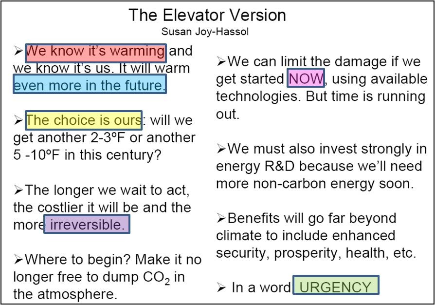
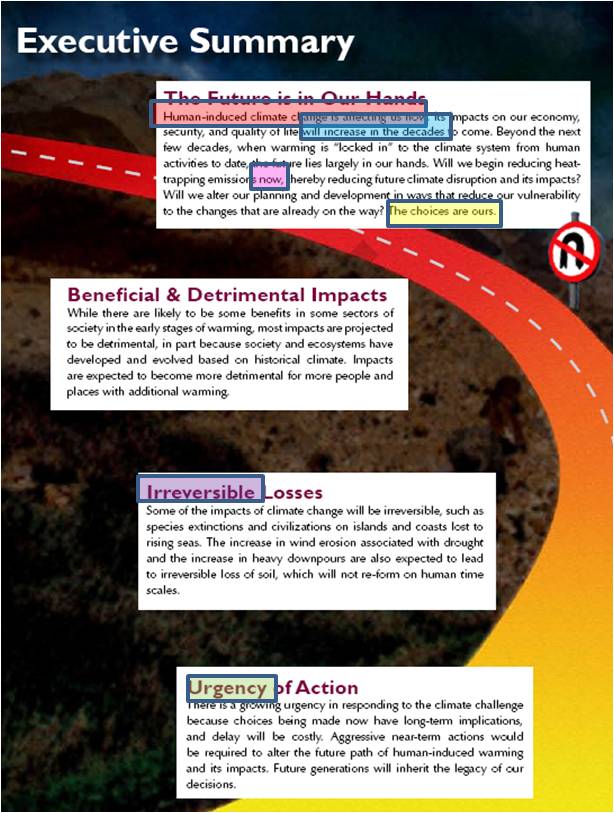
3. Hijacked Executive Summary But what is most troubling is the fact that the Executive Summary of the report repeats much of what the report’s non-governmental editor, Susan Joy Hassol calls her “Elevator Speech” of her personal political preferences on climate change. I personally agree with much of what she says, however the issue is not the details of the substance, but rather, how it is that the report’s editor was able to insert her personal policy preferences into the Executive Summary of the single most important report of the U.S. CCSP.

Below is a slide from one of Ms. Hassol’s lectures on climate change, delivered in the fall of 2006 (PDF). Below that image is am image of the first page of CCSP executive summary. I’ve color coded similar, and in some cases verbatim, phrases. The logic and substance of the two documents is remarkably similar and not at all scientific, but advocacy focused. Advocacy is appropriate in many contexts, and Ms. Hassol’s views are perfectly legitimate, but I expect to see neither political advocacy nor the editor’s personal views in the executive summary of the scientific research covered by the US CCSP Synthesis Report.

The CCSP explains that its authors should be technical experts:

Lead and contributing authors of the synthesis and assessment products are scientists or individuals with recognized technical expertise appropriate to a product. Lead and contributing authors may be citizens of any country and be drawn from within or outside the Federal government (e.g., universities or other public or private sector organizations). These individuals shall be acknowledged experts, known through their publication record and relevant accomplishments and contributions to their field. Lead authors are responsible for the content of the synthesis and assessment products that are submitted to the CCSP Interagency Committee for review.

The CCSP established a rigorous process for the writing and editing of its reports in order to limit the ability of political appointees to massage the report in desired directions. But apparently the CCSP review process has left a gaping hole for a single non-governmental, non-technical, non-expert to shape the report in politically desirable ways.

On an issue as high politicized as climate change, where bloggers and others are paying close attention, the inclusion of a doctored image, the cribbing of an old, misleading figure, and the inclusion of an editor’s personal views in the guise of a science assessment is remarkable, even in a draft for public comment. Even if the excuse is plain old sloppiness, the report is a big fat black eye for the world’s leading climate science program.

Draft CCSP Synthesis Report

July 28th, 2008

Posted by: Roger Pielke, Jr.

The U.S. Climate Change Science Program has put online for public comment a draft version of its synthesis report ( here in PDF), and I suppose the good news is that it is a draft, which means that it is subject to revision. But what the draft includes is troubling in several respects.

(more…)

A brief account of an aborted contribution to an ill-conceived debate

July 25th, 2008

Posted by: Roger Pielke, Jr.

A guest post by Dennis Bray and Hans von Storch

The July 2008 newsletter of the American Physical Society (APS) opened a debate concerning the IPCC consensus related to anthropogenic induced climate change. We responded with a brief comment concerning the state and changing state of consensus as indicated by two surveys of climate scientists. Data was presented concerning climate scientists assessments of the understanding of atmospheric physics, climate related processes, climate scientists level of agreement with the IPCC as representative of consensus and of the level of belief in anthropogenic warming. (The full manuscript is available here .) Our comment was summarily dismissed by the editors as polemic, political and unscientific. The following is a brief account of this episode.

(more…)

The IPCC, Scientific Advice and Advocacy

July 9th, 2008

Posted by: Roger Pielke, Jr.

For some time the leadership of the IPCC have sought to use the institution’s authority to promote a specific political agenda in the climate debate. The comments made yesterday by Rajendra Pachauri, head of the IPCC, place the organization in opposition to the G8 leaders position on climate change:

RK Pachauri, head of the Intergovernmental Panel on Climate Change (IPCC), on Tuesday slammed developed countries for asking India and China to cut greenhouse gas emissions while they themselves had not taken strong steps to cut down pollution.

“India can not be held for any emission control. They (developed countries) should get off the back of India and China,” Pachauri told reporters here.

“We are an expanding economy. How can we levy a cap when millions are living with deprivation? To impose any cap (on India) at a time when others (industrialised countries) are saying that they will reach the 1990 level of emission by 2025 is hazardous,” Pachauri said.

He said countries like the US and Canada should accept their responsibilities and show leadership in reducing green house gases like carbon dioxide and methane.

Pachauri said millions of Indian do not have access to electricity and their per capita income is much less. At this point, you cannot ask a country to “stop developing”.

Who does Dr. Pachauri speak for as head of the “policy neutral” IPCC?

It is as if the head of the CIA (or any other intelligence agency) decided to publicly criticize the government of Iran (or other country). Such behavior would seriously call into question the ability of the intelligence agency to perform its duties, which depend upon an ability to leave advocacy to other agencies. The United States has a Department of State responsible for international relations. The CIA collects intelligence in support of decision makers. These agencies have different roles in the policy process — hoenst broker and issue advocate.

The IPCC seems to want to both gather intelligence and decide what to do based on that intelligence. This is not a recipe for effective expert advice. Leaders in many areas would not stand for this conflation of advice and advocacy, so why does it continue to occur in the climate arena with little comment?

What the CCSP Extremes Report Really Says

June 20th, 2008

Posted by: Roger Pielke, Jr.

Yesterday the U.S. Climate Change Science Program released an assessment report titled “Weather and Climate Extremes in a Changing Climate” (PDF) with a focus on the United States. This post discusses some interesting aspects of this report, with an emphasis on what it does not show and does not say. It does not show a clear picture of ever increasing extreme events in the United States. And it does not clearly say why damage has been steadily increasing.

First, let me emphasize that the focus of the report is on changes in extremes in the United States, and not on climate changes more generally. Second, my comments below refer to the report’s discussion of observed trends. I do not discuss predictions of the future, which the report also covers. Third, the report relies a great deal on research that I have been involved in and obviously know quite well. Finally, let me emphasize that anthropogenic climate change is real, and deserving of significant attention to both adaptation and mitigation.

(more…)

Why Costly Carbon is a House of Cards

June 12th, 2008

Posted by: Roger Pielke, Jr.

How can the world achieve economic growth while at the same time decarbonizing the global economy?

This question is important because there is apt to be little public or political support for mitigation policies that increase the costs of energy in ways that are felt in reduced growth. Consider this description of reactions around the world to the recent increasing costs of fuel:

(more…)

Visually Pleasing Temperature Adjustments

June 2nd, 2008

Posted by: Roger Pielke, Jr.

This is a follow up to our continuing discussion of the possible implications of changes to mid-century global average temperatures for conclusions reached by the IPCC AR4, and how scientists react to such changes.

Over at Real Climate they pointed to the following figure as representing “a good first guess at what the change will look like” and asserted that it would have no meaningful implications for the trends in temperature rise since mid-century presented by the IPCC.

independent graph.jpg

Since there was some disagreement here in the comments of an earlier post about how to interpret this graph, I have decided to simply replicate it and then see if I could exactly replicate the graph from the Independent. The data is available here.

The first thing to note is that the Independent graph has a major error which Real Climate did not point out. It says that the smooth curve represents a 5-year average, when in fact, it actually represents a 21-point binomial filter. The difference in smoothing is critically important for interpreting what the graph actually says, and the error confused me and at least one climate scientist writing in our comments.

Here is a replication of the 21-point smoothing generated from the annual values, which will allow for my effort to replicate the graph from the Independent.

smooth seas.jpg

So far so good. But replication of the adjusted curve is a bit tricky as changing data for any one year has implications for the shape of the curve 10 years before that year and 10 years after. Upon trying to create a exact replication of the graph from The Independent, right away I realized that there was a major problem, because adding any increment to where Thompson et al. said it should begin (in 1945) instantly raised the adjusted curve to a point above the unadjusted curve. And as you can see in the Independent graph that at no point does the adjusted curve rise above the unadjusted curve, much less by a significant amount as implied by Thompson et al..

So right away it seems clear that we are not trying to make an adjustment that actually draws on the guidance from Thompson et al. This might seem odd, since the graph is supposed to show a proposed “guess” at the implications of Thompson et al. In any event, with that constraint removed I simply tried to get the best visual fit to the Independent graph that I could. And here is what I came up with.

compare.jpg

Now, given the complicated smoothing routine, there is certainly any number of combinations of weird adjustments that will result in a very similar looking curve. (And if anyone from CRU is reading and wants to share with us exactly what you used, and the basis for it, please do so.) The adjustments I used are as follows:

1945 0
1946 0
1947 0
1948 0.1
1949 0.25
1950 0.18
1951 0.18
1952 0.18
1953 0.18
1954 0.16
1955 0.16
1956 0
1957 0
1958 0
1959 0
1960 0

Oh yeah, the effect of these visually pleasing adjustments on the IPCC trend from 1950? Not that it actually means anything given the obvious incorrectness, but it would reduce the trend by about 15%.

Real Climate on Meaningless Temperature Adjustments

June 1st, 2008

Posted by: Roger Pielke, Jr.

[UPDATE]Real Climate did not like the figure shown below, so I responded to them with the following request, submitted as a comment on their site:

Hi Gavin-

I’d be happy to work from a proposed adjustment directly from you, rather than rely on the one proposed by Steve McIntyre or the one you point to from The Independent.

Thompson et al. write: “The new adjustments are likely to have a substantial impact on the historical record of global-mean surface temperatures through the middle part of the twentieth century.”

It is hard to see how temperatures around 1950 can change “substantially” with no effect on trends since 1950, but maybe you have a different view. Lets hear it. Give me some better numbers and I’ll use them.

Their response was to dodge the request:

Response: Nick Rayner, Liz Kent, Phil Jones etc. are perfectly capable of working it out and I’d suggest deferring to their experience in these matters. Whatever they come up with will be a considered and reasonable approach that will include the buoy and drifter issues as well as the post WW-II canvas bucket transition. Second guessing how that will work out in the absence of any actual knowledge would be foolish. – gavin

But doesn’t speculation that no changes will be needed to the IPCC trend estimates count as “second guessing,” or pointing to a graph in The Independent as likely being correct?

Similarly, in the comments below climate scientist James Annan criticized the graph in this post and when asked to provide an alternative adjustment, he declined to do so.

If these guys know what is “wrong” then they must have an idea about what is “right”.

Real Climate writes an entire post responding to Steve McIntyre’s recent discussions of buckets and sea surface temperatures, explaining why the issue doesn’t really matter, but for some weird reason they can’t seem to mention him by name or provide a link to what they are in fact responding to. (If the corrections don’t matter, then one wonders, why do them? Thompson et al. seemed to think that the issue matters.)

Real Climate does seem have mastered a passive voice writing style, however. Since they did have the courtesy to link here, before calling me “uninformed” (in deniable passive voice of course), I though a short response was in order.

Real Climate did not like our use of a proposed correction suggested by He Who Will Not Be Named. So Real Climate proposed another correction based on a graphic printed in The Independent. Never mind that the correction doesn’t seem to jibe with that proposed by Thompson et al., but no matter, we used the one suggested by Mr. Not-To-Be-Named so lets use Real Climate’s as well and see what difference it makes to temperature trends since 1950. Based on what Real Climate asserts (but oddly does not show with numbers), you’d think that their proposed adjustment results in absolutely no change to mid-20th century trends, and indeed anyone suggesting otherwise is an idiot or of ill-will. We’ll lets see what the numbers show.

The graph below shows a first guess at the effects of the Real Climate adjustments (based on a decreasing adjustment from 1950-60) based on the graphic in The Independent.

Real Climate Adjustment.jpg

What difference to trends since 1950 does it make? Instead of the about 50% reduction in the 1950-2007 trend from the first rough guess from you-know-who, Real Climate’s first guess results in a reduction of the trend by about 30%. A 30% reduction in the IPCC’s estimate in temperature trends since 1950 would be just as important as a 50% reduction, and questions of its significance would seem appropriate to ask. But perhaps a 30% reduction in the trend would be viewed as being “consistent with” the original trend ;-)

Try again Real Climate. And next time, his name is STEVE MCINTYRE — and his blog is called CLIMATE AUDIT. There is a lot of science and civil discussion there, with a healthy mix of assorted experts and a range of ordinary folks. Questioning scientific conclusions is a lot healthier for science than rote defense, but we all learned that in grad school, didn’t we?