US GDP vs. Carbon Dioxide Emissions 1949-2007
April 6th, 2009Posted by: Roger Pielke, Jr.
[UPDATED]
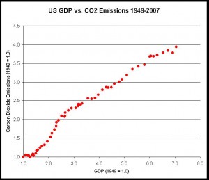
In the United States, how tightly is economic growth coupled to carbon dioxide emissions? The following graph shows US GDP and commercial carbon dioxide emissions (both set to 1.0 in 1949) for the period 1949-2007. You can see that the US economy has progressively decarbonized, meaning that it has seen progressively less commercial carbon dioxide emissions per unit of GDP, but at the same time, the relationship of GDP and emissions remains very, very close. (Note: Emissions data from EIA and GDP data from BEA.)
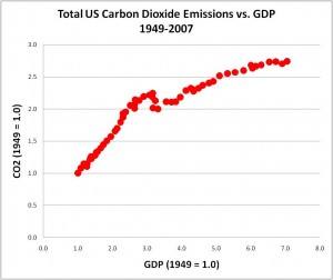
Below is a graph showing total U.S. carbon dioxide emissions versus GDP for the same time period.


April 6th, 2009 at 10:52 am
Yes the US is more efficient at converting emissions to GDP than China.
Taxing US emissions more than Chinese emissions will move production from the US to China, raising global emissions per GDP.
Moving production to China will lower the US GDP and decrease our emissions.
If someone could calculate the break even point for how much our GDP has to decrease to cancel out the additional emissions from China I have a follow up question.
Why?
April 6th, 2009 at 10:58 am
2006 (second to last point) looks like an outlier to me. Maybe a data problem at EIA?
April 6th, 2009 at 11:32 am
Missing from the data is land use/farming. Most of the small scale farming in places like the NE have disappeared since 1949. Much of these farms and countryside has become reforested. Farming has become much more efficient. Is there a data source for this factor. My recollection is land use is greater than 20% of emissions
April 6th, 2009 at 12:52 pm
Roger
EIA explains the 2006 point as a mild weather year.
April 6th, 2009 at 2:06 pm
-4-maurmike
Maybe that is it, but surely there were other mild weather years since 1949 as compared to years before and after?
April 6th, 2009 at 7:20 pm
Are the GDP numbers inflation adjusted?
April 6th, 2009 at 7:58 pm
-6-Curt
Yes
April 6th, 2009 at 10:54 pm
Roger,
Can you give a more precise link to the CO2 data that were used in the chart? According to my reading of the numbers for energy-related CO2 emissions in the EIA table, these are given as 5991 m. tons in 2007, which is only 2.75 times the level of emissions in 1949 – not the ratio of 4.0 that appears to be shown on the vertical axis of your chart. Am I misunderstanding your analysis?
April 7th, 2009 at 6:47 am
-8-Ian
You are correct. The graph shows commercial US CO2 emissions, not total. I have updated the post to make this clear, and also added a new graph showing total US CO2 emissions, which jibes with your numbers. Thanks for the close read.
FYI, the CO2 data that I used is here:
http://www.eia.doe.gov/oiaf/1605/ggrpt/excel/historical_co2.xls
-6-Curt
Yes
April 7th, 2009 at 7:27 am
Roger
When you total all of the emissions 1949-2007 you come up with 250GT. Using your 2.13GT=1PPMV this equates to adding 120 PPM. Assuming half is absorbed that leaves 60PPM for the US alone from just fuel. Since this can’t be right what’s wrong with my calculation?
Mike McHenry
April 7th, 2009 at 7:33 am
-10-Mike
I get 255 Gt CO2, which is what I assume you get.
To convert to C divide by 3.7, giving about 69 Gt C.
Using your 50% for airborne fraction, that leaves 34.5 Gt C.
To convert to PPM divide by 2.13, giving about 16 ppm.
April 7th, 2009 at 8:21 am
Roger
Thanks. I didn’t realize you calculated as carbon not CO2. How is the 2.13 number calculated? Interestingly it goes from amazingly large to amazingly small number.
April 7th, 2009 at 8:31 am
-12-Mike
The 2.13 comes from ORNL, see Table 3 here:
http://cdiac.ornl.gov/pns/convert.html
April 7th, 2009 at 9:38 am
Roger
That’s a very informative page. Is 50% adsorption reasonable assumption? Thanks Mike
April 7th, 2009 at 1:36 pm
-14-Mike
I discuss some of this literature in my recent paper on air capture:
http://sciencepolicy.colorado.edu/admin/publication_files/resource-2716-2009.03.pdf