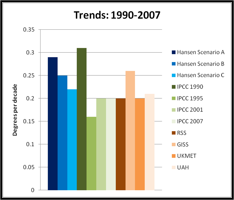
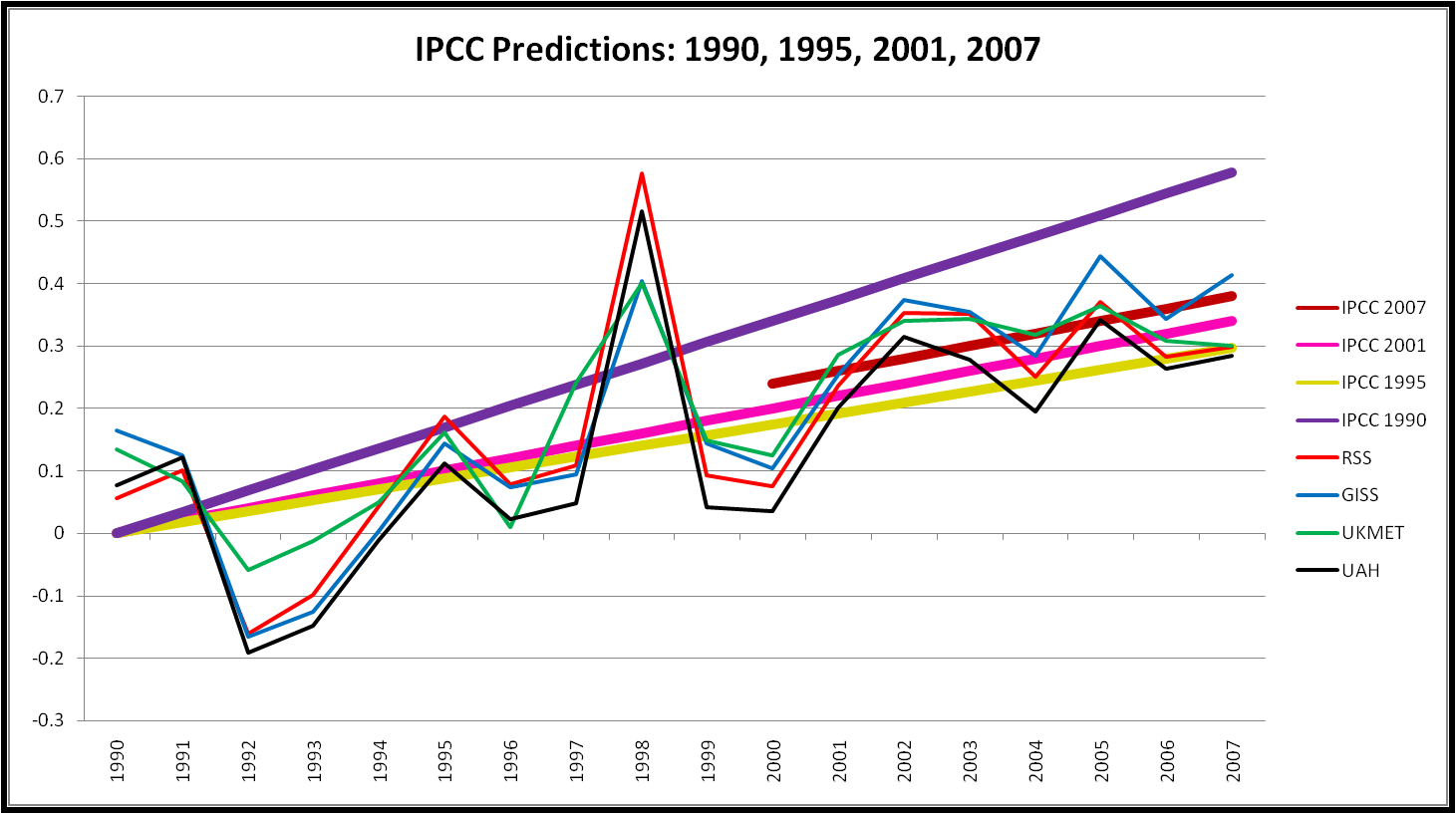
The figure below shows linear trends in temperature for Jim Hansen’s three 1988 scenarios (in shades of blue), for the IPCC predictions issued in 1990, 1995, 2001, 2007 (in shades of green), and for four sets of observations (in shades of brown). I choose the period 1990-2007 because this is the period of overlap for all of the predictions (except IPCC 2007, which starts in 2000).

Looking just at these measures of central tendency (i.e., no formal consideration of uncertainties) it seems clear that:
1. Trends in all of Hansen’s scenarios are above IPCC 1995, 2001, and 2007, as well as three of the four surface observations.
2. The outlier on surface observations, and the one consistent with Hansen’s Scenarios A and B is the NASA dataset overseen by Jim Hansen. Whatever the explanation for this, good scientific practice would have forecasting and data collection used to verify those forecasts conducted by completely separate groups.
3. Hansen’s Scenario A is very similar to IPCC 1990, which makes sense given their closeness in time, and assumptions of forcings at the time (i.e., thoughts on business-as-usual did not change much over that time).
The data for the Hansen scenarios was obtained at Climate Audit from the ongoing discussion there, and the IPCC and observational data is as described on this site over the past week or so in the forecast verification exercise that I have conducted. This is an ongoing exercise, as part of a conversation across the web, so if you have questions or comments, please share them, either here, or if our comment interface is driving you nuts (as it is with me), then comment over at Climate Audit where I’ll participate in the discussions.


