Forecast Verification for Climate Science, Part 3
January 9th, 2008Posted by: Roger Pielke, Jr.
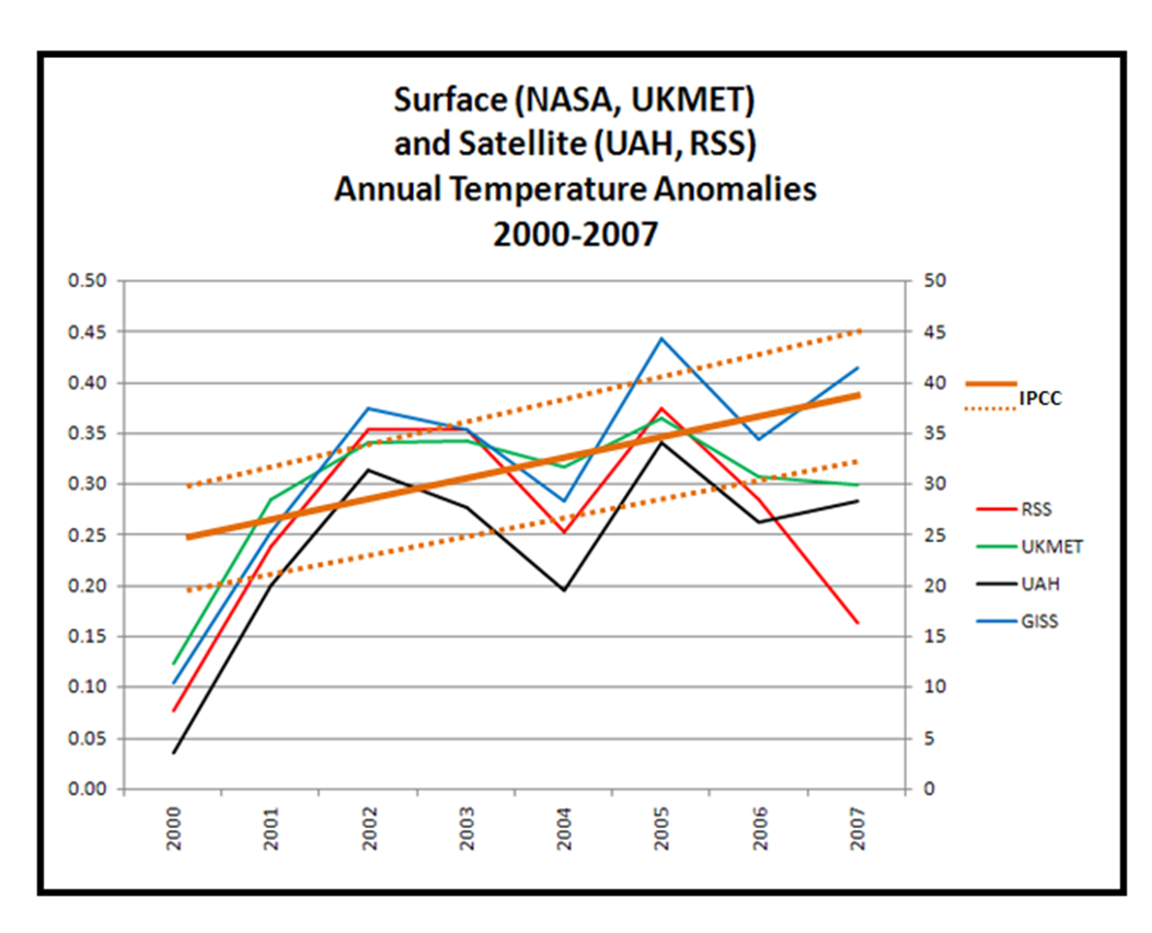
By popular demand, here is a graph showing the two main analyses of global temperatures from satellite, from RSS and UAH, as well as the two main analyses of global temperatures from the surface record, UKMET and NASA, plotted with the temperature predictions reported in IPCC AR4, as described in Part 1 of this series.
Some things to note:
1) I have not graphed observational uncertainties, but I’d guess that they are about +/-0.05 (and someone please correct me if this is wildly off), and their inclusion would not alter the discussion here.
2) A feast for cherrypickers. One can arrive at whatever conclusion one wants with respect to the IPCC predictions. Want the temperature record to be consistent with IPCC? OK, then you like NASA. How about inconsistent? Well, then you are a fan of RSS. On the fence? Well, UAH and UKMET serve that purpose pretty well.
3) Something fishy is going on. The IPCC and CCSP recently argued that the surface and satellite records are reconciled. This might be the case from the standpoint of long-term liner trends. But the data here suggest that there is some work left to do. The UAH and NASA curves are remarkably consistent. But RSS dramatically contradicts both. UKMET shows 2007 as the coolest year since 2001, whereas NASA has 2007 as the second warmest. In particular estimates for 2007 seem to diverge in unique ways. It’d be nice to see the scientific community explain all of this.
4) All show continued warming since 2000!
5) From the standpoint of forecast verification, which is where all of this began, the climate community really needs to construct a verification dataset for global temperature and other variables that will be (a) the focus of predictions, and (b) the ground truth against which those predictions will be verified.
Absent an ability to rigorously evaluate forecasts, in the presence of multiple valid approaches to observational data we run the risk of engaging in all sorts of cognitive traps — such as availability bias and confirmation bias. So here is a plea to the climate community: when you say that you are predicting something like global temperature or sea ice extent or hurricanes — tell us is specific detail what those variables are, who is measuring them, and where to look in the future to verify the predictions. If weather forecasters, stock brokers, and gamblers can do it, then you can too.
January 9th, 2008 at 7:07 am
Ross McKitrick writes in:
“- In my view the key metric has to be the mean temperature of the tropical troposphere. Fig 10.7 of the AR4:
http://ipcc-wg1.ucar.edu/wg1/Report/suppl/Ch10/Ch10_indiv-maps.html is remarkably consistent across models that the warming will be focused in that region, and that it is expected to be differentially strong compared to
other regions and the surface, right from the get-go. Also, the hindcast (IPCC Fig 9,1) shows that no other forcing is expected to produce the uniquely focused warming there. The other strong warming region is the Arctic surface, but it is geographically small and subject to many other influences.
- In response to my T3 Tax essays (http://ross.mckitrick.googlepages.com/#t3tax), some commenters have said that stratospheric cooling is really the appropriate metric. This measure might be confounded with reduced solar output (though apparently the effects are not identical, see the paper on this by Bengtsson http://www.nerc-essc.ac.uk/~olb/PAPERS/len24.pdf). In any case I find it very curious that RSS shows no cooling, and possibly a slight (insignificant) warming trend in the stratosphere over the past 15 years, while CO2 has gone up by at least 25 ppm. And prior to that there was no “trend” per se, just 2 flat intervals interrupted by step-like changes associated with big volcanoes.
http://www.remss.com/data/msu/graphics/plots/sc_Rss_compare_TS_channel_tls.png“
January 9th, 2008 at 1:35 pm
Hi Roger,
You write, “So here is a plea to the climate community: when you say that you are predicting something like global temperature or sea ice extent or hurricanes — tell us is specific detail what those variables are, who is measuring them, and where to look in the future to verify the predictions. If weather forecasters, stock brokers, and gamblers can do it, then you can too.”
Again, you seem to be working under the assumption that the climate change community is interested in doing science. The evidence shows very clearly that they’re not.
Here’s how a real scientist would approach the problem of predicting future global average temperature:
1) Develop probability distributions for all climate forcing factors, e.g. CO2, CH4, N2O, black carbon, sulfur dioxide, organic carbon, etc.
In other words, don’t develop a bunch of ridiculously bogus “scenarios” that have absolutely no assessment of the likelihood of occurrence.
Instead, take one variable at a time, and construct a probability distribution for that variable in the coming century. For example, the current atmospheric methane concentration is about 2780 ppb:
Atmospheric methane
What are the 50 percent probability estimate values for 2010, 2020, 2030, 2040, etc. Also, what are the 10 percent and 90 percent probability estimates (that is, less than a 10 percent chance of being below that value, and a 90 percent chance of being below that value) for each of those years.
2) Develop probability distributions for the forcing associated with those estimated values. For example, methane is estimated to have a global warming potential of 62 over 20 years, and 23 over 100 years. But those are (presumably) “50 percent probability” values. Probability distributions would need to be assessed.
3) Combine the probability distributions for all the variables into a probability distribution for total climate forcing.
4) Combine that probability distribution for climate forcing with a probability distribution for climate sensitivity, to produce…
5) …temperature probability distribution for the coming century.
I think the problem with using this real-science approach is that most scientists would end up agreeing that the “50 percent probability” value for warming in the 21st century would be less than 2.0 deg C. That simply would not scare enough people.
January 10th, 2008 at 1:04 am
This from Jos de Laat, a climate scientist in the Netherlands,
“With regard to your post on satellite temperature observations, I would like to draw your attention to this post on worldclimatereport.com. They noticed the same issue with the cooling in the RSS temperatures, but it contains, a.o., an update (9 January) on this issue with some quotes from John Christy. According to him, the RSS data contains some spurious cooling during the last several of months, so UAH has the better series during that period. Well, read for yourself:
http://www.worldclimatereport.com/index.php/2008/01/08/musings-on-satellite-temperatures/“
January 10th, 2008 at 1:55 am
Climate Scientist James Annan, emails me to point to a comment in his own blog saying that this exercise is somehow “wrong” but he doesn’t explain why it is wrong. You can also see in his comments some of the haughtiness that is all-too-characteristic of many climate scientists.
http://julesandjames.blogspot.com/
January 10th, 2008 at 1:59 am
John Tierney kindly follows up this discussion on his NYTimes blog.
http://tierneylab.blogs.nytimes.com/2008/01/10/a-spot-check-of-global-warming/
In particular, he invites the RealClimate folks to suggest predictions and data that might be used for those interested in verifying IPCC forecasts. I hope that they respond.
January 10th, 2008 at 10:38 am
There seem to be two separate issues here:
1) How one would, hypothetically test a theory, like AGW or the Enhanced Green House Effect (EGHE) and ‘
2) Whether or not the current data are sufficient, and / or accurate.
In my opinion: Of course you compare the theoretical predictions to data. A theory that never obtains sufficient empirical support remains unproven. A theory that is actually contradicted by lots of data is falsified.
So, of course, if we collect lots of good data, and the theory of AGW doesn’t match, we through it out.
As for the recent satelitte data– it appear there has been a problem? If so, it will be sorted out.
But all this means is we may need to be a bit suspicious of very recent data. But it strikes me huge numbers of people is on both sides of this debate watch the data like a horse race. Doesn’t one AGW believing blogger show a constantly updating plot showing the extent of ice coverage? Don’t hoards of people watch the hurricane count breathlessly all summer?
The main problem with making conclusions based on 7 years is beta error. Given the variability of weather, it’s not enough data to falsify. Getting enough data to prove anything to a 5% confidence level in 7 years requires luck.
Strangely, *proving* things false actually takes longer.(Normally this is not a problem because the scientific convention is supposed to be to treat a theory, product or as unproven until it has a lot of empirical support.)
January 11th, 2008 at 9:20 pm
Looking at the UAH interpretation of the satellite data shows that the southern hemisphere – that would be the one not affected (maybe we should say afflicted) by the vast majority of black carbon and land use changes – has not warmed this century.
January 12th, 2008 at 6:45 am
The confidence interval on the forecast looks wrong.
I am not a climate specialist, but anyone with a knowledge of statistics would suspect something is amiss here. There is too much data scatter compared to the confidence interval.
I did a bit of research, and found the variance in the annual average global temperature anomaly is around 0.1 degree C (1975 to the present). If that is the case, the minimum 95% confidence interval for evaluating a forecast must be at least +/- 0.2 degree. And that is just to account for the expected annual anomaly variation. It should probably be even larger, since each measurement system has an additional measurement error associated with it.
The chart should have drawn error bands at least 0.2 degrees above and below the forecast.
January 14th, 2008 at 7:54 am
Zinfan, did you ever get a response?