Verification of IPCC Temperature Forecasts 1990, 1995, 2001, and 2007
January 14th, 2008Posted by: Roger Pielke, Jr.
Last week I began an exercise in which I sought to compare global average temperature predictions with the actual observed temperature record. With this post I’ll share my complete results.
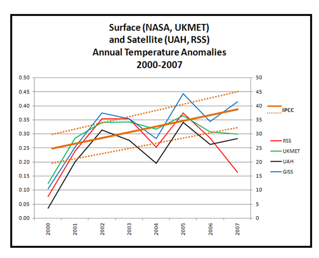
Last week I showed a comparison of the 2007 IPCC temperature forecasts (which actually began in 2000, so they were really forecasts of data that had already been observed). Here is that figure.
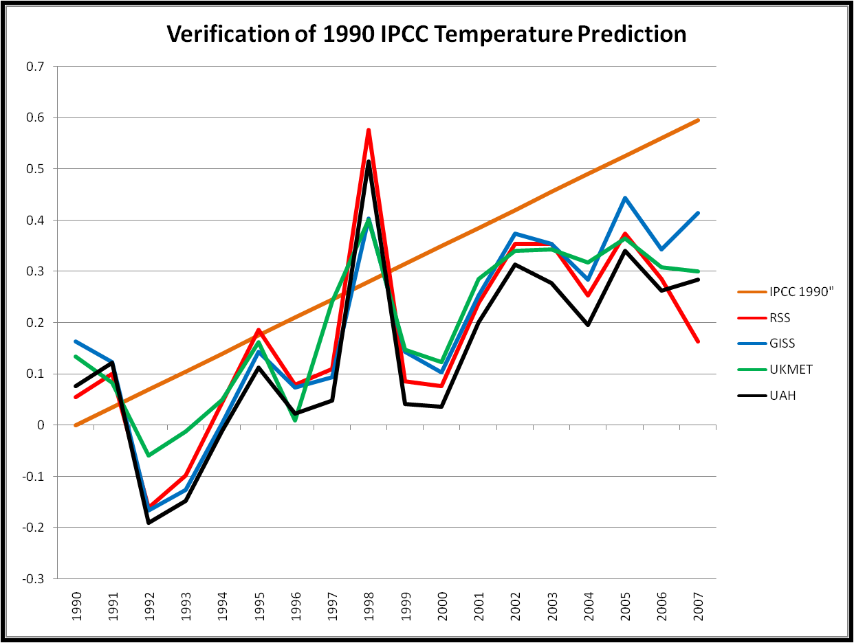
Then I showed a figure with a comparison of the 1990 predictions made by the IPCC in 1992 with actual temperature data. Some folks misinterpreted the three curves that I showed from the IPCC to be an uncertainty bound. They were not. Instead, they were forecasts conditional on different assumptions about climate sensitivity, with the middle curve showing the prediction for a 2.5 degree climate sensitivity, which is lower than scientists currently believe to the most likely value. So I have reproduced that graph below without the 1.5 and 4.5 degree climate sensitivity curves.
Now here is a similar figure for the 1995 forecast. The IPCC in 1995 dramatically lowered its global temperature predictions, primarily due to the inclusion of consideration of atmospheric aerosols, which have a cooling effect. You can see the 1995 IPCC predictions on pp. 322-323 of its Second Assessment Report. Figure 6.20 shows the dramatic reduction of temperature predictions through the inclusion of aerosols. The predictions themselves can be found in Figure 6.22, and are the values that I use in the figure below, which also use a 2.5 degree climate sensitivity, and are also based on the IS92e or IS92f scenarios.
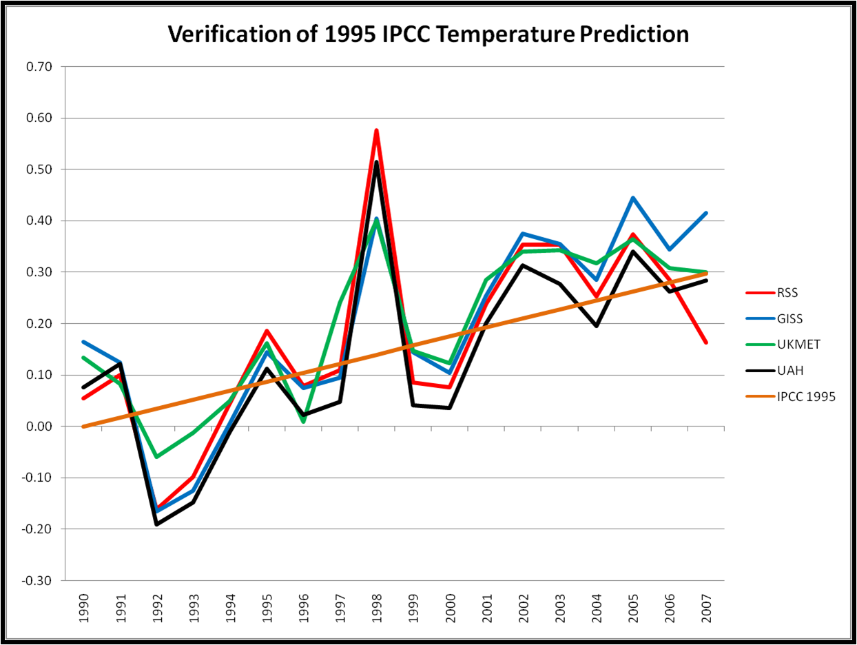
In contrast to the 1990 prediction, the 1995 prediction looks spot on. It is worth noting that the 1995 prediction began in 1990, and so includes observations that were known at the time of the prediction.
In 2001, the IPCC nudged its predictions up a small amount. The prediction is also based on a 1990 start, and can be found in the Third Assessment Report here. The most relevant scenario is A1FI, and the average climate sensitivity of the models used to generate these predictions is 2.8 degrees, which may be large enough to account for the difference between the 1995 and 2001 predictions. Here is a figure showing the 2001 forecast verification.
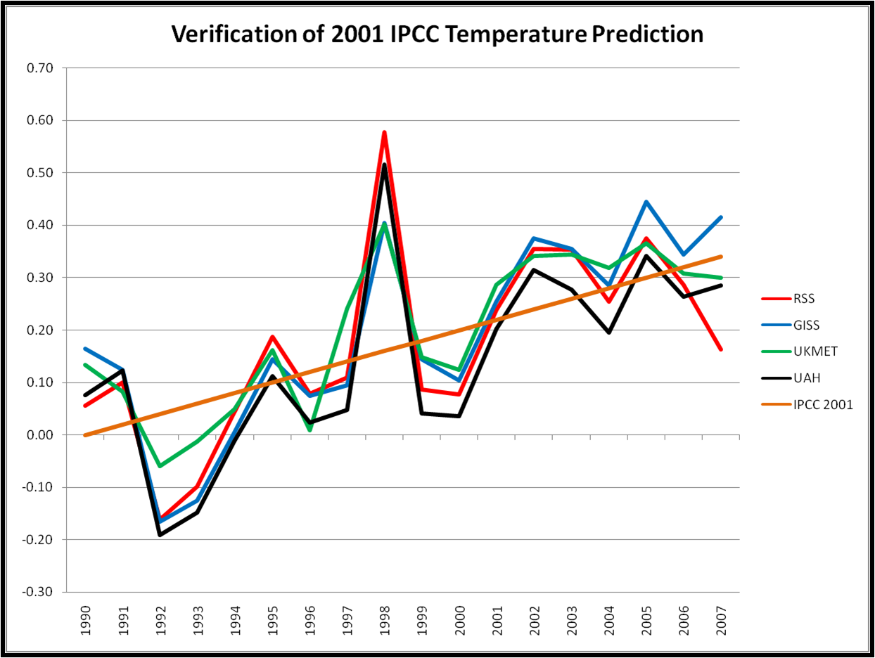
Like 1995, the 2001 figure looks quite good in comparison to the actual data.
Now we can compare all four predictions with the data, but first here are all four IPCC temperature predictions (1990, 1995, 2001, 2007) on one graph.
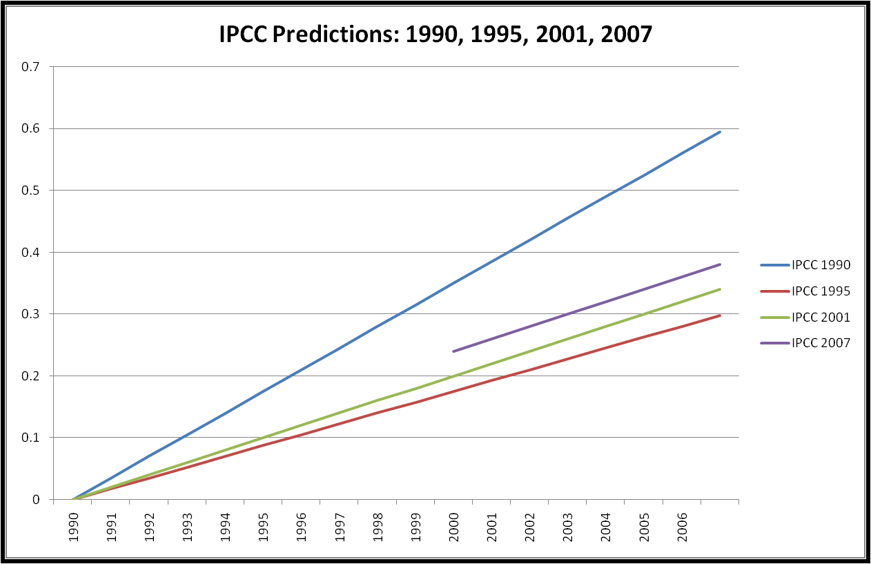
IPCC issued its first temperature prediction in 1990 (I actually use the prediction from the supplement to the 1990 report issued in 1992). Its 1995 report dramatically lowered this prediction. 2001 nudged this up a bit, and 2001 elevated the entire curve another small increment, keeping the slope the same. My hypothesis for what is going on here is that the various changes over time to the IPCC predictions reflect incrementally improved fits to observed temperature data, as more observations have come in since 1990.
In other words, the early 1990s showed how important aerosols were in the form of dramatically lowered temperatures (after Mt. Pinatubo), and immediately put the 1990 predictions well off track. So the IPCC recognized the importance of aerosols and lowered its predictions, putting the 1995 IPCC back on track with what had happened with the real climate since its earlier report. With the higher observed temperatures in the late 1990s and early 2000s the slightly increased predictions of temperature in 2001 and 2007 represented better fits with observations since 1995 (for the 2001 report) and 2001 (for the 2007 report).
Imagine if your were asked to issue a prediction for the temperature trend over next week, and you are allowed to update that prediction every 2nd day. Regardless of where you think things will eventually end up, you’d be foolish not to include what you’ve observed in producing your mid-week updates. Was this behavior by the IPCC intentional or simply the inevitable result of using a prediction start-date years before the forecast was being issued? I have no idea. But the lesson for the IPCC should be quite clear: All predictions (and projections) that it issues should begin no earlier than the year that the prediction is being made.
And now the graph that you have all been waiting for. Here is a figure showing all four IPCC predictions with the surface (NASA, UKMET) and satellite (UAH, RSS) temperature record.
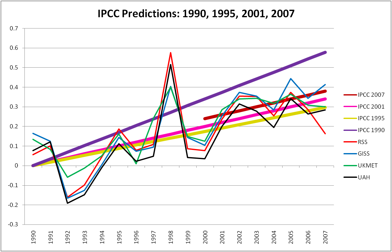
You can see on this graph that the 1990 prediction was obviously much higher than the other three, and you can also clearly see how the IPCC temperature predictions have creeped up as observations showed increasing temperatures from 1995-2005. A simple test of my hypothesis is as follows: In the next IPCC, if temperatures from 2005 to the next report fall below the 2007 IPCC prediction, then the next IPCC will lower its predictions. Similarly, if values fall above that level, then the IPCC will increase its predictions.
What to take from this exercise?
1. The IPCC does not make forecast verification an easy task. The IPCC does not clearly identify what exactly it is predicting nor the variables that can be used to verify those predictions. Like so much else in climate science this leaves evaluations of predictions subject to much ambiguity, cherrypicking, and seeing what one wants to see.
2. The IPCC actually has a pretty good track record in its predictions, especially after it dramatically reduced its 1990 prediction. This record is clouded by an appearance of post-hoc curve fitting. In each of 1995, 2001, and 2007 the changes to the IPCC predictions had the net result of improving predictive performance with observations that had already been made. This is a bit like predicting today’s weather at 6PM.
3. Because the IPCC clears the slate every 5-7 years with a new assessment report, it is guarantees that its most recent predictions can never be rigorously verified, because, as climate scientists will tell you, 5-7 years is far too short to say anything about climate predictions. Consequently, the IPCC should not predict and then move on, but pay close attention to its past predictions and examine why the succeed or fail. As new reports are issued the IPCC should go to great lengths to place its new predictions on an apples-to-apples basis with earlier predictions. The SAR did a nice job of this, more recent reports have not. A good example of how not to update predictions is the predictions of sea level rise between the TAR and AR4 which are not at all apples-to-apples.
4. Finally, and I repeat myself, the IPCC should issue predictions for the future, not the recent past.
Appendix: Checking My Work
The IPCC AR4 Technical Summary includes a figure (Figure TS.26) that shows a verification of sorts. I use that figure as a comparison to what I’ve done. Here is that figure, with a number of my annotations superimposed, and explained below.
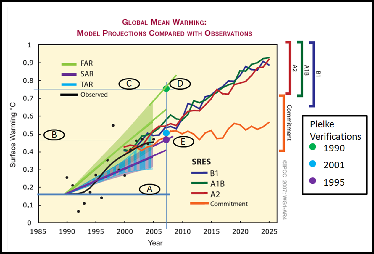
Let me first say that the IPCC probably could not have produced a more difficult-to-interpret figure (I see Gavin Schmidt at Real Climate has put out a call for help in understanding it). I have annotated it with letters and some lines and I explain them below.
A. I added this thick horizontal blue line to indicate the 1990 baseline. This line crosses a thin blue line that I placed to represent 2007.
B. This thin blue line crosses the vertical axis where my 1995 verification value lies, represented by the large purple dot.
C. This thin blue line crosses the vertical axis where my 1990 verification value lies, represented by the large green dot. (My 2001 verification is represented by the large light blue dot.)
D. You can see that my 1990 verification value falls exactly on a line extended from the upper bound of the IPCC curve. I have also extended the IPCC mid-range curve as well (note that my extension superimposed falls a tiny bit higher than it should). Why is this? I’m not sure, but one answer is that the uncertainty range presented by the IPCC represents the scenario range, but of course in the past there is no scenario uncertainty. Since emissions have fallen at the high end of the scenario space, if my interpretation is correct, then my verification is consistent with that of the IPCC.
E. For the 1995 verification, you can see that similarly my value falls exactly on a line extended from the upper end of the IPCC range. This would also be consistent with the IPCC presenting the uncertainty range as representing alternative scenarios. The light blue dot is similarly at the upper end of the blue range. What should not be missed is that the relative difference between my verifications and those of the IPCCs are just about identical.
A few commenters over at Real Climate, including Gavin Schmidt, have suggested that such figures need uncertainty bounds on them. In general, I agree, but I’d note that none of the model predictions presented by the IPCC (B1, A1B, A2, Commitment — note that all of these understate reality since emissions are following A1FI, the highest, most closely) show any model uncertainty whatsoever (nor any observational uncertainty, nor multiple measures of temperature). Surely with the vast resources available to the IPCC, they could have done a much more rigorous job of verification.
In closing, I guess I’d suggest to the IPCC that this sort of exercise should be taken up as a formal part of its work. There are many, many other variables (and relationships between variables) that might be examined in this way. And they should be.
January 13th, 2008 at 3:10 pm
Your 1990 number is wrong. The 2.5deg sensitivity model does not have such a large early trend under any IS92 scenario (fig Ax.3). I pointed this out to you previously so I’m not sure why you haven’t corrected it. If you correct it, it will line up with the midpoint of the ‘FAR’ projections in the figure – still high, but less so.
January 13th, 2008 at 3:52 pm
Gavin-
I have not “corrected” it because I have a different interpretation than you do on the 1992 scenarios. We have a difference of opinion. I won’t be so arrogant to suggest that you “correct” your thinking because reasonable people can disagree on such things.
As I pointed out to you, Figure A3.1 in that same report shows very large differences across scenarios prior to 2000, so I am not at all convinced that choice of scenario is irrelevant.
But even though I see things differently, perhaps you are right, and instead of 0.6 in 2007, it is something like 0.45. But as you imply, your point doesn’t alter the overall conclusions of the analysis — the IPCC dramatically reduced its predictions in 1995 (which it acknowledges explicitly). (And a point I do not raise, the 1992 FAR Supplement reduced the original predictions from 1990.)
Like your post at Real Climate last week, you are emphasizing a minor detail where you quibble and are trying to use it to discredit the entire analysis. A common blog debate technique.
Do you disagree with any of my overall conclusions, or is it just that one detail?
January 14th, 2008 at 12:47 am
Roger, it is not a matter of ‘opinion’. Figure Ax.3 in the 1992 shows all the results for the 2.5deg sensitivity model; the results to 2010 are very similar for all scenarios and none of them approach 0.6 deg/C for 2007 (by a long way). Instead of accusing me of having some kind of agenda, just fix it.
As to the other criticisms, I didn’t expect that I need to repeat myself over and again, but since you insist:
1) forecast verification is fine.
2) like must be compared with like
3) all sources of uncertainty need to be dealt with front and center
If you want to compare long term projections (which for FAR/SAR/TAR is all you have), you need to compare them with long term trends in the data along with the uncertainties in the calculations of those trends. Where you have mutliple GCM projections (available for AR4), you could do a better job because you have the trends and the envelope of results for individual years. Ill-defined error bars as in your first figure are misleading.
However, even once you have done all that, the conclusion will remain the same. i.e. the IPCC forecasts have been reasonable (even the corrected 1992 value). The same conclusion was drawn previously in AR4 and Rahmstorf et al 2007. This is somewhat comforting, but is mainly a reflection of the long term global mean response to long term global mean forcing.
January 14th, 2008 at 1:56 am
Gavin-
Wow. This is the fifth time I’ve responded to you on the exact same point (twice by email, once at RC, now twice here). You seem determined to change the subject to this nit pick in order to discredit the entire analysis.
I will repeat: Perhaps you are correct and the value for 2007 1990 IPCC is as low as 0.45. It does not change my conclusions.
Your efforts to say that all IPCC predictions are consistent with the data is quite a contortion, even after the IPCC itself explained that it dramatically reduced its 1990 predictions. Your contortions provide good evidence why people with a vested interest in predictions (via being involved in their creation) ought not be involved in their verification.
As far as your complaints about the display of uncertainties, this criticism is best directed at the IPCC as I have simply emulated their approach.
And, if you have a better approach to verification that you’d like to share, I am sure that it would be a positive contribution to looking at past forecasts.
January 14th, 2008 at 2:32 am
I’m not sure what game you trying to play here, but frankly I just don’t have the time or interest to carry on. Do what you want.
January 14th, 2008 at 3:38 am
Let me play this back to see if I have it right. Because what you are saying initially struck me as odd. Since the IPCC is using a sensitivity more like 3 in current forecasts (I think) and 2.5 in 1990, it seems odd on its face that one would say that they have reduced their forecasts.
But what I think you are saying is that while their outyear forecasts may in fact be higher (say for 2090 or so) in the most recent FAR, they are inserting aerosol cooling assumptions in early years that reduce the slope in early years. So, campared to the 1990 forecast, forecasts today have a reduced slope in the early years and perhaps a higher slope in later years. Correct?
This obviously introduces some problems for validating forecasts. Is the aerosol cooling assumption (which must be substantial given the change in the early years forecasts**) a valid physical phenomenon or a fudge factor that masks the fact that the IPCC is still overforecasting. Since the early year slope does not lead to “catastrophe” we still are not able to validate the elements of the forecast that make it catastrophic.
** I say the cooling must be substantial because, vis a vis the 1990 forecast, the temperatures fail to track even a 1.5 sensitivity but now the same temperatures are tracking a 3.0+
January 14th, 2008 at 3:40 am
Pete Rawlinson writes in by email:
“Can I just say how accurate I think your recent report is. I feel the Real Climate article and Gavin have been very unkind to you.
I’m sure you don’t need me to help you out, but I have been investigating the IPCC statements in their 1995 update, and can I point out to you the Summary they published in 1995 from this document: http://www.ipcc.ch/pdf/climate-changes-1995/spm-science-of-climate-changes.pdf
This was their summary for Policymakers and on Page 3 at the bottom the paragraph of the 2nd bullet point is quite clear in the IPCC stating quite clearly that their new estimate was approximately 1/3 lower compared to 1990, mainly due to the inclusion of cooling aerosols and understanding of the Carbon Cycle. Your report on the 1990 over estimation is absolutely 100% correct. The IPCC even state this themselves in 1995!
Extract from above IPPC 1995 report:
“For the midrange IPCC emission scenario, IS92a, assuming the “best estimate” value of
climate sensitivity4 and including the effects of future increases in aerosol, models project an
increase in global mean surface air temperature relative to 1990 of about 2°C by 2100. This
estimate is approximately onethird lower than the “best estimate” in 1990. This is due primarily
to lower emission scenarios (particularly for CO2 and the CFCs), the inclusion of the cooling
effect of sulphate aerosols, and improvements in the treatment of the carbon cycle.”"
January 14th, 2008 at 3:47 am
Coyote- Thanks for your questions. In doing a forecast evaluation it is important to distinguish the forecast from the assumptions of the forecast. The IPCC did indeed use a 2.5 degree climate sensitivity in 1990 and 1995.
In 1995 the IPCC reduced its forecasts across the board, both near and long term. In Pete Rawlinson’s comment about he points to the IPCC’s description of this.
January 14th, 2008 at 3:51 am
For what it’s worth, I’ve been comparing the GISS model II scenarios to GISS and HadCrut GMST data collected over the land and ocean, and restricting comparison to data only after 1983. (Page 9342 of the paper indicates runs were initiated in 1983.)
No matter how plot data and predictions on paper, either a) The data always show less warming than the scenarios or
b) The data sort of match “scenario C” which is supposed to have less forcing than we actually had.
The only way I’ve found to make the match look good is to do all of these things:
a)show a squished little graph
b) include 25 years data collected before 1984 (and before models were run),
c) include projection past 2007 (so as to squish the graph more) and
d) compare predictions to GMST measurements taken exclusively over land throwing out the 70% of information over the oceans.
That particular collection of choices doesn’t seem a particularly fair way to assess the predictive value of the model.
I’m not entirely sure it’s possible to do a decent data comparison between the Hansen data and the real measurements; some difficulties stem from the exclusive use of anomalies rather than real temperatures. (Or, at least if Hansen reports the real temperatures for the simulations, I can’t find those in the paper itself!)
January 14th, 2008 at 4:43 am
Very interesting comparison, Roger. I suspect much of Gavin’s annoyance has to do with not being accustomed to answering to anyone.
I believe that I felt better about NASA’s use of my tax money back when it was a space agency. Now that NASA has become Al Gore’s tax-supported global warming sidekick, I am beginning to resent NASA’s tax consumption.
January 14th, 2008 at 5:58 am
Since Gavin agrees forcasting is good, and like should be compared to like, why not ask him to add Hansen et al. 1988 scenarios A,B, and C to the graph at his post showing the 8 year trendlines.
If he likes, he can also add the uncertainty intervals to the data and to the Scenario predictions.
I would think after adding error bars, he would then have a forecast verification chart that comes close to comparing ‘like to like’ (Land-Ocean empircal data to land-ocean computations) and using exclusively forecast data and which meets his standards for showing error bars.
That would be big improvement over he squished little graph he’s show in the past.
Of course, it will make it appear that Hansen’s predictions over estimated the temperature increase.
January 14th, 2008 at 8:17 am
Did the IPCC provide any justification for moving the 0 mark back two years when they raised the 2007 line? I found it odd that the other 3 lines (1992, 1995, and 2001) all intersected at 1990. I am just wondering why they raised the line when the last 9 years suggest that it should be lower. Of course, in light of the past 9 years leveling off without cooling from volcanic sulphate aerosols, I would have thought the 2007 line should have been lowered or have less slope.
Oh, and Lucia, they are not error bars. It is kind of like the financial industry that shows the possible amount of return on investment with possible scenarios. At least the financial industry includes small print that explains that they are just estimates and the realized savings (realized temperatures in our example) may lay outside of the scenarios shown.
John M Reynolds
January 14th, 2008 at 8:22 am
Gavin refuses to respond to my question:
http://www.realclimate.org/?comments_popup=523#comment-79149
Should not all scientists be able to quickly and easily answer such a question? I invite Dr. Pielke to comment.
January 14th, 2008 at 9:50 am
Donald– What I mean is that Gavin has now explained that he insists on error bars when verifying forecasts. So…. if he adds error bars to Hansen’s original ABC scenarios, and slaps them on that graph he recently posted at RC, voila! That should meet his standards for verification.
Of course, there is a problem. Hansen never provided error bars for the projections. But, if Gavin’s standards require the error bars of Roger, I suspect Gavin could add them when he does his forcast verification of Hansen ABC scenarios.
Oh.. but I’m forgetting! Gavin already did his forecast verification of Hansen. Yet, somehow, Gavin included no error bars.
(In my opinion, error bars are not required on every single “look at this” type post on a *blog*!)
January 14th, 2008 at 12:26 pm
Gavin, et al — What observations would falsify your understanding of global climate change?
Hi Donald,
Here are some personal answers I’d give. They’re similar to, but not exactly the same as, answers I gave Roger a couple years ago. All these are absent any significant volcanic activity in any of the years of concern:
1) If the global surface temperature anomaly dropped by more than 0.7 deg C in 2008,
2) If the 5-year average anomaly centered around 2010 was more than 0.5 deg C lower than the 5-year average centered around 2005, and
3) If the 5-year average anomaly centered around 2015 was more than 0.2 deg C lower than the 5-year average centered around 2015.
January 14th, 2008 at 2:12 pm
Here’s a question for those who think models forecast(ed?) the current climate.
How many models predicted that Antarctica would cool for these last few decades?
January 14th, 2008 at 11:01 pm
Mark. I assume that last 2015 is a typo in your third point. Otherwise, that point is impossible to meet. As well, when you discuss the 5-year average, which data set would you accept? GISS or Satellite or…? As Rodger’s top graph shows, the RSS, UKMET, and UAH data sets are all below the IPCC’s lowest scenario prediction. Actually, that graph confuses me a bit. Does it include all of 2007 or all of 2000? The extra tick marks on the x-axis seem to indicate the middle of the year.
Harry, the IPCC reports already show that the warming signature above the tropics, that was predicted if warming was anthropogenic, have not been realized.
John M Reynolds
January 17th, 2008 at 1:33 pm
Hi John,
You write, “I assume that last 2015 is a typo in your third point.”
Yes, the third comment should have been, “3) If the 5-year average anomaly centered around 2015 was more than 0.2 deg C lower than the 5-year average centered around 2005.”
“As well, when you discuss the 5-year average, which data set would you accept? GISS or Satellite or…?”
If the question is whether anthropogenic global warming caused by greenhouse gases is the question, satellite measurements are clearly preferable. A surface thermometer can be changed simply by putting a parking lot nearby, or letting the housing get dirty. And there are the questions about representative placement. Plus, they simply don’t measure temperatures throughout the entire height of the troposphere. If the goal is to measure tropospheric temperature increase caused by greenhouse gases, satellites are clearly superior. (Of course, there are still substantial with satellites, apparently especially regarding software.)
Theoretically, the surface and satellite would match. But if they didn’t, I’d definitely be more skeptical about the surface measurements.
May 23rd, 2008 at 11:13 am
insterested about this, thank