Updated Chart: IPCC Temperature Verification
January 14th, 2008Posted by: Roger Pielke, Jr.
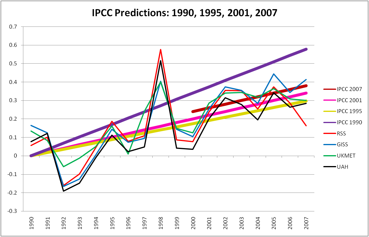
I’ve received some email comments suggesting that my use of the 1992 IPCC Supplement as the basis for IPCC 1990 temperature predictions was “too fair” to the IPCC because the IPCC actually reduced its temperature projections from 1990 to 1992. In addition, Gavin Schmidt and a commenter over at Climate Audit also did not like my use of the 1992 report. So I am going to take full advantage of the rapid feedback of the web to provide an updated figure, based on IPCC 1990, specifically, Figure A.9, p. 336. In other words, I no longer rely on the 1992 supplement, and have simply gone back to the original IPCC 1990 FAR. Here then is that updated Figure:
Thanks all for the feedback!
January 15th, 2008 at 4:13 am
Sent in by email:
I have always found the global mean temperature as a rather poor
metric for understanding what the models are predicting. It would be
much better to present global temperature maps to see if the models
represent reality. After all, a global average could be right and
hide an outlandish model that had polar bears at the equator and
crocodiles at the poles. In additon, global average temperature is
not something that anyone experiences. Local climate is only
determined by local weather, which is why a temperature map would be a
much better way to gauge the models.
I would suggest that a true test would be publication of global
temperature maps for 2009, .., 2014 in the next few months. There is
good data going back to 1980, nearly thirty years, so the complaint of
a short time window doesn’t hold anymore. It would also be
interesting to compare the predictions of the two dozen models and
check the level of agreement among them. It could be quite revealing.
Regards,
Paul S. Linsay–