Forecast Verification for Climate Science
January 7th, 2008Posted by: Roger Pielke, Jr.
Last week I asked a question:
What behavior of the climate system could hypothetically be observed over the next 1, 5, 10 years that would be inconsistent with the current consensus on climate change?
We didn’t have much discussion on our blog, perhaps in part due to our ongoing technical difficulties (which I am assured will be cleared up soon). But John Tierney at the New York Times sure received an avalanche of responses, many of which seemed to excoriate him simply for asking the question, and none that really engaged the question.
I did receive a few interesting replies by email from climate scientists. Here is one of the most interesting:
The IPCC reports, both AR4 (see Chapter 10) and TAR, are full of predictions made starting in 2000 for the evolution of surface temperature, precipitation, precipitation intensity, sea ice extent, and on and on. It would be a relatively easy task for someone to begin tracking the evolution of these variables and compare them to the IPCC’s forecasts. I am not aware of anyone actually engaged in this kind of climate forecast verification with respect to the IPCC, but it is worth doing.
So I have decided to take him up on this and present an example of what such a verification might look like. I have heard some claims lately that global warming has stopped, based on temperature trends over the past decade. So global average temperature seems like a as good a place as any to provide an example.
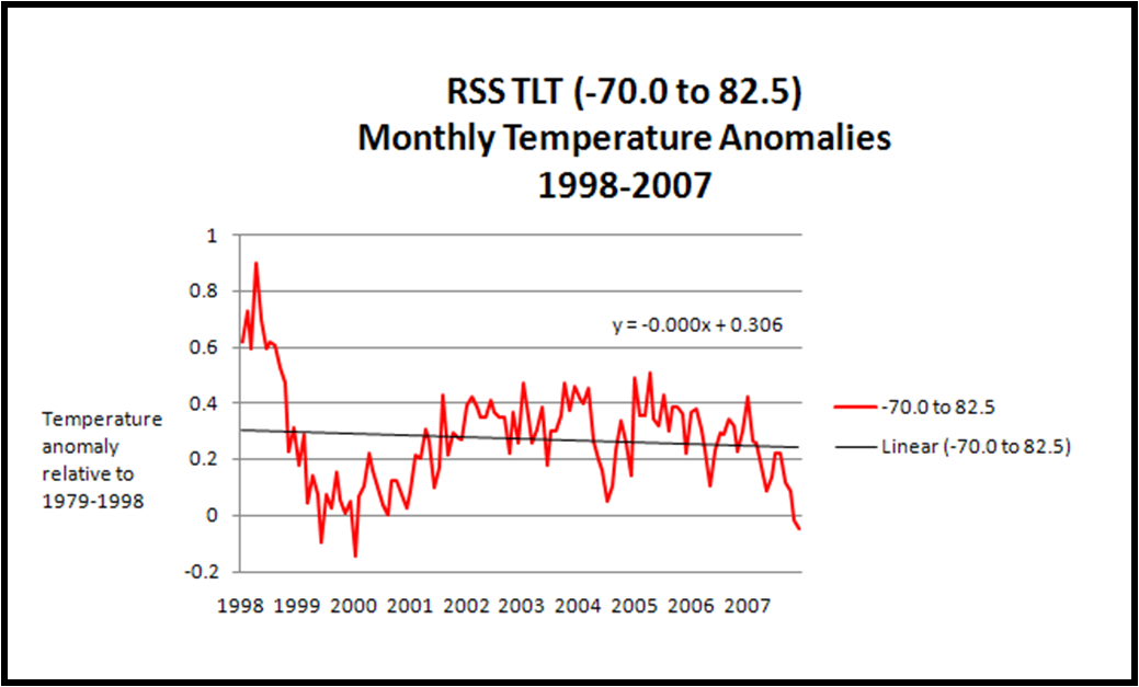
I begin with the temperature trends. I have decided to use the satellite record provided by Remote Sensing Systems, mainly because of the easy access of its data. But the choice of satellite versus surface global temperature dataset should not matter, since these have been reconciled according to the IPCC AR4. Here is a look at the satellite data starting in 1998 through 2007.

This dataset starts with the record 1997/1998 ENSO event which boosted temperatures a good deal. It is interesting to look at, but probably not the best place to start for this analysis. A better place to start is with 2000, but not because of what the climate has done, but because this is the baseline used for many of the IPCC AR4 predictions.
Before proceeding, a clarification must be made between a prediction and a projection. Some have claimed that the IPCC doesn’t make predictions, it only makes projections across a wide range of emissions scenarios. This is just a fancy way of saying that the IPCC doesn’t predict future emissions. But make no mistake, it does make conditional predictions for each scenario. Enough years have passed for us to be able to say that global emissions have been increasing at the very high end of the family of scenarios used by the IPCC (closest to A1F1 for those scoring at home). This means that we can zero in on what the IPCC predicted (yes, predicted) for the A1F1 scenario, which has best matched actual emissions.
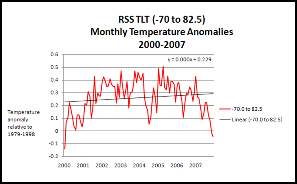
So how has global temperature changed since 2000? Here is a figure showing the monthly values, indicating that while there has been a decrease in average global temperature of late, the linear trend since 2000 is still positive.

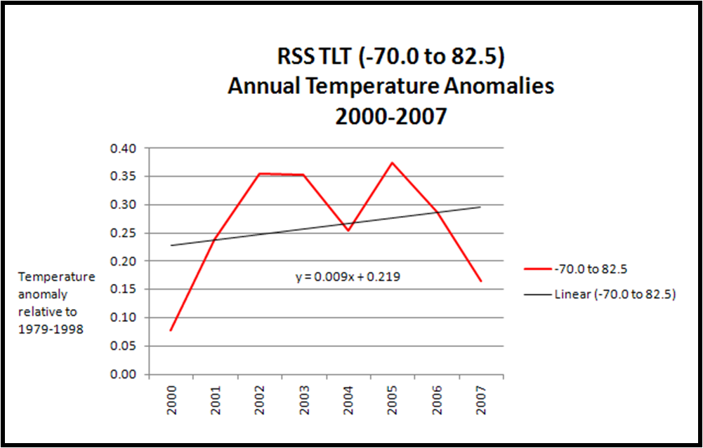
But monthly values are noisy, and not comparable with anything produced by the IPCC, so let’s take a look at annual values.

The annual values result in a curve that looks a bit like an upwards sloping letter M.
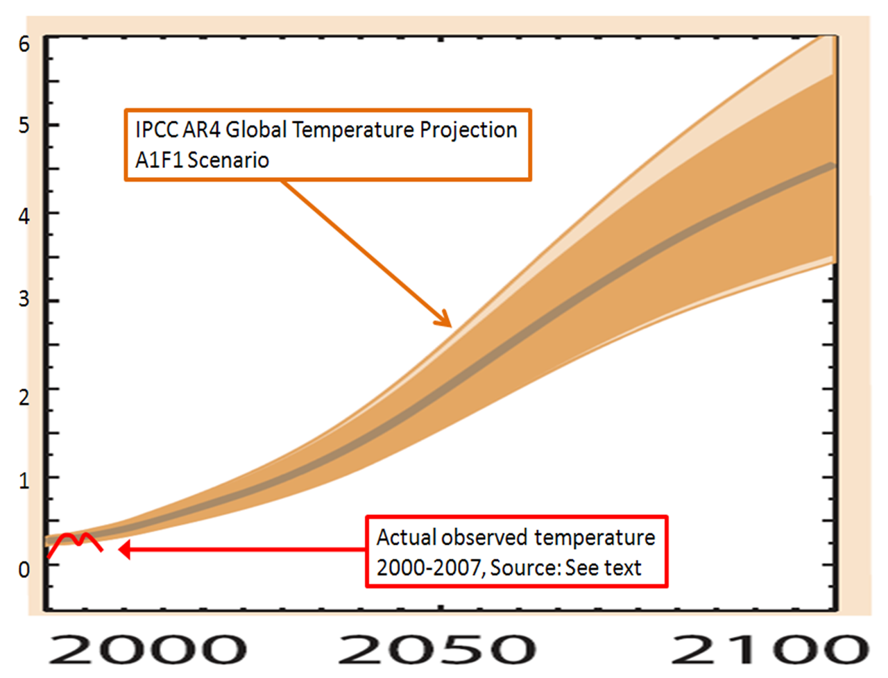
The model results produced by the IPCC are not readily available, so I will work from their figures. In the IPCC AR4 report Figure 10.26 on p. 803 of Chapter 10 of the Working Group I report (here in PDF) provides predictions of future temperature as a function of emissions scenario. The one relevant for my purposes can be found in the bottom row (degrees C above 1980-2000 mean) and second column (A1F1).
I have zoomed in on that figure, and overlaid the RSS temperature trends 2000-2007 which you can see below.

Now a few things to note:
1. The IPCC temperature increase is relative to a 1980 to 2000 mean, whereas the RSS anomalies are off of a 1979 to 1998 mean. I don’t expect the differences to be that important in this analysis, particularly given the blunt approach to the graph, but if someone wants to show otherwise, I’m all ears.
2. It should be expected that the curves are not equal in 2000. The anomaly for 2000 according to RSS is 0.08, hence the red curve begins at that value. Figure 10.26 on p. 803 of Chapter 10 of the Working Group I report actually shows observed temperatures for a few years beyond 2000, and by zooming in on the graph in the lower left hand corner of the figure one can see that 2000 was in fact below the A1B curve.
So it appears that temperature trends since 2000 are not closely following the most relevant prediction of the IPCC. Does this make recent temperature trends inconsistent with the IPCC? I have no idea, and that is not the point of this post. I’ll leave it to climate scientists to tell us the significance. I assume that many climate scientists will say that there is no significance to what has happened since 2000, and perhaps emphasize that predictions of global temperature are more certain in the longer term than shorter term. But that is not what the IPCC figure indicates. In any case, 2000-2007 may not be sufficient time for climate scientists to become concerned that their predictions are off, but I’d guess that at some point, if observations don’t match predictions they might be of some concern. Alternatively, if observations square with predictions, then this would add confidence.
Before one dismisses this exercise as an exercise in randomness, it should be observed that in other contexts scientists associated short term trends with longer-term predictions. In fact, one need look no further than the record 2007 summer melt in the Arctic which was way beyond anything predicted by the IPCC, reaching close to 3 million square miles less than the 1978-2000 mean. The summer anomaly was much greater than any of the IPCC predictions on this time scale (which can be seen in IPCC AR4 Chapter 10 Figure 10.13 on p. 771). This led many scientists to claim that because the observations were inconsistent with the models, that there should be heightened concern about climate change. Maybe so. But if one variable can be examined for its significance with respect to long-term projections, then surely others can as well.
What I’d love to see is a place where the IPCC predictions for a whole range of relevant variables are provided in quantitative fashion, and as corresponding observations come in, they can be compared with the predictions. This would allow for rigorous evaluations of both the predictions and the actual uncertainties associated with those predictions. Noted atmospheric scientist Roger Pielke, Sr. (my father, of course) has suggested that three variables be looked at: lower tropospheric warming, atmospheric water vapor content, and oceanic heat content. And I am sure there are many other variables worth looking at.
Forecast evaluations also confer another advantage – they would help to move beyond the incessant arguing about this or that latest research paper and focus on true tests of the fidelity of our ability to forecast future states of the climate system. Making predictions and them comparing them to actual events is central to the scientific method. So everyone in the climate debate, whether skeptical or certain, should welcome a focus on verification of climate forecasts. If the IPCC is indeed settled science, then forecast verifications will do nothing but reinforce that conclusion.
For further reading:
Pielke, Jr., R.A., 2003: The role of models in prediction for decision, Chapter 7, pp. 113-137 in C. Canham and W. Lauenroth (eds.), Understanding Ecosystems: The Role of Quantitative Models in Observations, Synthesis, and Prediction, Princeton University Press, Princeton, N.J. (PDF)
Sarewitz, D., R.A. Pielke, Jr., and R. Byerly, Jr., (eds.) 2000: Prediction: Science, decision making and the future of nature, Island Press, Washington, DC. (link) and final chapter (PDF).
January 9th, 2008 at 12:40 pm
Hi Roger,
You write,
Before proceeding, a clarification must be made between a prediction and a projection. Some have claimed that the IPCC doesn’t make predictions, it only makes projections across a wide range of emissions scenarios.
Some have claimed that? Who claims that is NOT the case? The IPCC’s Third Assessment Report said very clearly:
Scenarios are images of the future or alternative futures. They are neither predictions nor forecasts.
Then you write:
Enough years have passed for us to be able to say that global emissions have been increasing at the very high end of the family of scenarios used by the IPCC (closest to A1F1 for those scoring at home).
But this neglects the fact that CO2 is *not* the only agent whose emissions have an effect on global temperature. There is also methane CH4. And black carbon. And others. And that’s just on the warming side. On the cooling side there are sulfur dioxide, organic carbon, and others.
So a more accurate assessment would involve looking at the total climate forcing for the various scenarios (not just CO2).
If you go to Figure 10.26 of the Fourth Assessment Report, you’ll see that for 2010, virtually all the scenarios have the same climate forcing of approximately 2.0 Watts per square meter.
Of course, you seem to be working from the premise that the IPCC is interested in doing good science. The evidence is overwhelmingly against you. (I’d be happy to debate the matter. I’m sure it would be of interest to Prometheus readers. And it’s definitely important to climate change policy.)