Visually Pleasing Temperature Adjustments
June 2nd, 2008Posted by: Roger Pielke, Jr.
This is a follow up to our continuing discussion of the possible implications of changes to mid-century global average temperatures for conclusions reached by the IPCC AR4, and how scientists react to such changes.
Over at Real Climate they pointed to the following figure as representing “a good first guess at what the change will look like” and asserted that it would have no meaningful implications for the trends in temperature rise since mid-century presented by the IPCC.
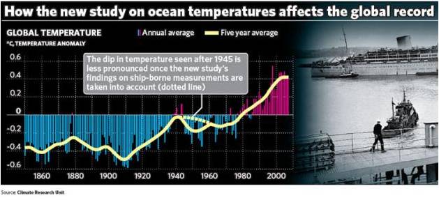
Since there was some disagreement here in the comments of an earlier post about how to interpret this graph, I have decided to simply replicate it and then see if I could exactly replicate the graph from the Independent. The data is available here.
The first thing to note is that the Independent graph has a major error which Real Climate did not point out. It says that the smooth curve represents a 5-year average, when in fact, it actually represents a 21-point binomial filter. The difference in smoothing is critically important for interpreting what the graph actually says, and the error confused me and at least one climate scientist writing in our comments.
Here is a replication of the 21-point smoothing generated from the annual values, which will allow for my effort to replicate the graph from the Independent.
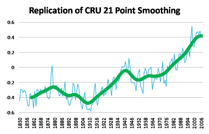
So far so good. But replication of the adjusted curve is a bit tricky as changing data for any one year has implications for the shape of the curve 10 years before that year and 10 years after. Upon trying to create a exact replication of the graph from The Independent, right away I realized that there was a major problem, because adding any increment to where Thompson et al. said it should begin (in 1945) instantly raised the adjusted curve to a point above the unadjusted curve. And as you can see in the Independent graph that at no point does the adjusted curve rise above the unadjusted curve, much less by a significant amount as implied by Thompson et al..
So right away it seems clear that we are not trying to make an adjustment that actually draws on the guidance from Thompson et al. This might seem odd, since the graph is supposed to show a proposed “guess” at the implications of Thompson et al. In any event, with that constraint removed I simply tried to get the best visual fit to the Independent graph that I could. And here is what I came up with.
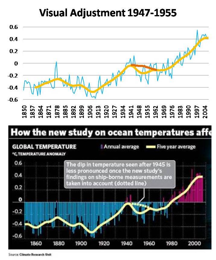
Now, given the complicated smoothing routine, there is certainly any number of combinations of weird adjustments that will result in a very similar looking curve. (And if anyone from CRU is reading and wants to share with us exactly what you used, and the basis for it, please do so.) The adjustments I used are as follows:
1945 0
1946 0
1947 0
1948 0.1
1949 0.25
1950 0.18
1951 0.18
1952 0.18
1953 0.18
1954 0.16
1955 0.16
1956 0
1957 0
1958 0
1959 0
1960 0
Oh yeah, the effect of these visually pleasing adjustments on the IPCC trend from 1950? Not that it actually means anything given the obvious incorrectness, but it would reduce the trend by about 15%.