Archive for January, 2008

Worldwatch Wants You to Think

January 18th, 2008

Posted by: Roger Pielke, Jr.

prius v nano.png

Worldwatch asks a challenging question:

One car gets 46 miles per gallon, features fancy accessories, and sports two engines with a combined 145 horsepower. The other car reportedly gets 54 miles per gallon, runs on a diminutive 30-horsepower engine, and is positively spartan in its interior trimmings. The first is a darling of the environmentally conscious. The latter is reviled as a climate wrecker. These two vehicles are the Toyota Prius and the newly unveiled Tata Nano, dubbed “the people’s car.” Is there a double standard?

2008 Edition of Science and Engineering Indicators Out Now

January 17th, 2008

Posted by: admin

Yesterday I attended the official release of the 2008 edition of Science and Engineering Indicators, the biennial compendium of facts, figures, charts and graphs on the U.S. science and engineering enterprise (there is international data, but its typically presented for context). It’s produced by a subcommittee of the National Science Board, with the support of the NSF Statistics staff. You can read the press release and wade through the online version to see all the details.

As part of their effort to continually adjust (I don’t want to judge whether it’s improved or not) the message presented by the Indicators, this edition was accompanied by two additional documents. One of them is a Digest of charts and graphs that various science advocacy groups will flog over the next two years to argue how badly their disciplines are being screwed in the research budget. (They are, but that’s for another post – tune in Friday). There is also a policy document about R&D and international competitiveness. Those who have followed the discussions in this area won’t see a lot of new material, simply updated arguments with the perpetual sky is falling perspective. The policy document is a relatively new addition to Indicators. This follows a similar document with the 2006 edition that focused on STEM education.

While the document is presented as a policy-neutral object, there are always hidden assumptions and presumptions that are useful to tease out. Just ask some questions, like what’s missing? For example…

(more…)

New Paper on Normalized Hurricane Damages

January 17th, 2008

Posted by: Roger Pielke, Jr.

Normalized Hurricane Damage.png

Our paper on normalized hurricane damages 1900 to 2005 has now been published. By “normalized” we mean taking damages as recorded in the year that they occurred in that year’s dollars, and adjusting them to account for societal changes such as population growth, building stock, tangible wealth, and inflation. The figure above shows the results of one of the two approaches to normalization presented in our paper.

The full paper can be found at the link below and an Excel dataset can be found here.

Pielke, Jr., R. A., Gratz, J., Landsea, C. W., Collins, D., Saunders, M., and Musulin, R., 2008. Normalized Hurricane Damages in the United States: 1900-2005. Natural Hazards Review, 9:29-42. (PDF)

A few brief comments follow.

(more…)

UKMET Short Term Global Temperature Forecast

January 16th, 2008

Posted by: Roger Pielke, Jr.

UKMET Short Term Forecast.png

This figure shows a short-term forecast of global average temperature issued by the UK Meteorological Service, with some annotations that I’ve added and described below. The forecast is discussed in this PDF where you can find the original figure. This sort of forecast should be applauded, because it allows for learning based on experience. Such forecasts, whether eventually shown to be wrong or right, can serve as powerful tests of knowledge and predictive skill. The UK Met Service is to be applauded. Now on to the figure itself.

The figure is accompanied by this caption:

Observations of global average temperature (black line) compared with decadal ‘hindcasts’ (10-year model simulations of the past, white lines and red shading), plus the first decadal prediction
for the 10 years from 2005. Temperatures are plotted as anomalies (relative to 1979–2001). As with short-term weather forecasts there remains some uncertainty in our predictions of temperature over a decade. The red shading shows our confidence in predictions of temperature in any given year. If there are no volcanic eruptions
during the forecast period, there is a 90% likelihood of the temperature being within the shaded area.

The figure shows both hindcasts and a forecast. I’ve shaded the hindcasts in grey. I’ve added the green curve which is my replication of the global temperature anomalies from the UKMET HADCRUT3 dataset extended to 2007. I’ve also plotted as a blue dot the prediction issued by UKMET for 2008, which is expected to be indistinguishable from the temperature of years 2001 to 2007 (which were indistinguishable from each other). The magnitude of the UKMET forecast over the next decade is almost exactly identical to the IPCC AR4 prediction over the same time period, which I discussed last week.

I have added the pink star at 1995 to highlight the advantages offered by hindcasting. Imagine if the model realization begun in 1985 had been continued beyond 1995, rather than being re-run after 1995. Clearly, all subsequent observed temperatures would have been well below that 1985 curve. One important reason for this is of course the eruption of Mt. Pinatubo, which was not predicted. And that is precisely the point — prediction is really hard, especially when conducted in the context of open systems, and as is often said, especially about the the future. Our ability to explain why a prediction was wrong does not make that prediction right, and this is a point often lost in debate about climate change.

Again, kudos to the UK Met Service. They’ve had the fortitude to issue a short term prediction related to climate change. Other scientific bodies should follow this lead. It is good for science, and good for the use of science in decision making.

Verification of IPCC Sea Level Rise Forecasts 1990, 1995, 2001

January 15th, 2008

Posted by: Roger Pielke, Jr.

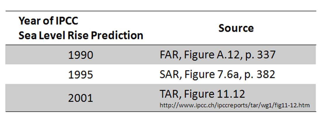
Here is a graph showing IPCC sea level rise forecasts from the FAR (1990), SAR (1995), and TAR (2001).

IPCC Sea Level.png

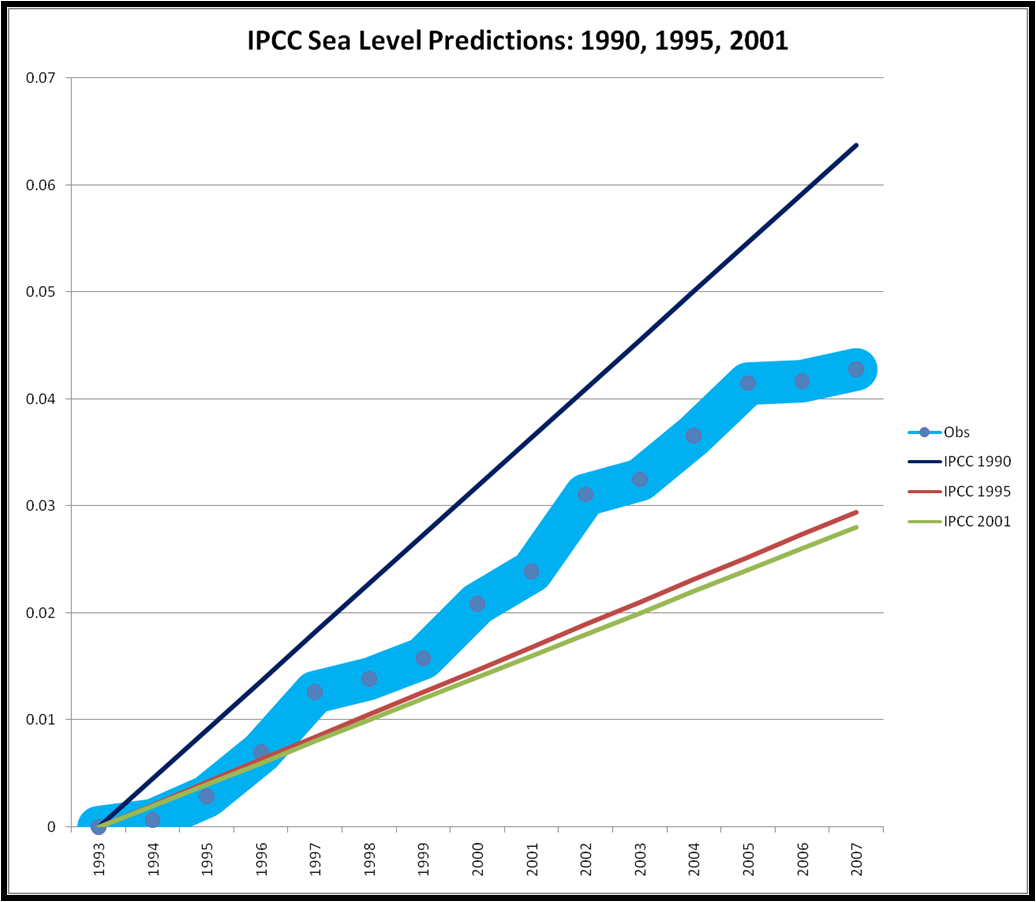
And here are the sources:

IPCC Sea Level Sources.png

Observational data can be found here. Thanks to my colleague Steve Nerem.

Unlike temperature forecasts by the IPCC, sea level rise shows no indication that scientists have a handle on the issue. As with temperature the IPCC dramatically decreased its predictions of sea level rise in between its first (1990) and second (1995) assessment reports. It then nudged down its prediction a very small amount in its 2001 report. The observational data falls in the middle of the 1990 and 1995/2001 assessments.

Last year Rahmstorf et al. published a short paper in Science comparing observations of temperature with IPCC 2001 predictions (Aside: it is remarkable that Science allowed them to ignore IPCC 1990 and 1995). Their analysis is completely consistent with the temperature and sea level rise verifications that I have shown. On sea level rise they concluded:

Previous projections, as summarized by IPCC, have not exaggerated but may in some respects even have underestimated the change, in particular for sea level.

This statement is only true if one ignores the 1990 IPCC report which overestimated both sea level rise and temperature. Rahmstorf et al. interpretation of the results is little more than spin, as it would have been equally valid to conclude based on the 1990 report:

Previous projections, as summarized by IPCC, have not underestimated but may in some respects even have exaggerated the change, both for sea level and temperature.

Rather than spin the results, I conclude that the ongoing debate about future sea level rise is entirely appropriate. The fact that the IPCC has been unsuccessful in predicting sea level rise, does not mean that things are worse or better, but simply that scientists clearly do not have a handle on this issue and are unable to predict sea level changes on a decadal scale. The lack of predictive accuracy does not lend optimism about the prospects for accuracy on the multi-decadal scale. Consider that the 2007 IPCC took a pass on predicting near term sea level rise, choosing instead to focus 90 years out (as far as I am aware, anyone who knows differently, please let me know).

This state of affairs should give no comfort to anyone: over the 21st century sea level is expected to rise, anywhere from an unnoticeable amount to the catastrophic, and scientists have essentially no ability to predict this rise, much less the effects of various climate policies on that rise. As we’ve said here before, this is a cherrypickers delight, and a policy makers nightmare. It’d be nice to see the scientific community engaged in a bit less spin, and a bit more comprehensive analysis.

James Hansen on One Year’s Temperature

January 14th, 2008

Posted by: Roger Pielke, Jr.

NASA’s James Hansen just sent around a commentary (in PDF here) on the significance of the 2007 global temperature in the context of the long-term temperature record that he compiles for NASA. After Real Climate went nuts over how misguided it is to engage in a discussion of eight years worth of temperature records, I can”t wait to see them lay into Jim Hansen for asserting that one year’s data is of particular significance (and also for not graphing uncertainty ranges):

The Southern Oscillation and the solar cycle have significant effects on year-to-year global temperature change. Because both of these natural effects were in their cool phases in 2007, the unusual warmth of 2007 is all the more notable.

But maybe it is that data that confirms previously held beliefs is acceptable no matter how short the record, and data that does not is not acceptable, no matter how long the record. But that would be confirmation bias, wouldn’t it?

Anyway, Dr. Hansen does not explain why the 2007 NASA data runs counter to that of UKMET, UAH or RSS, but does manage to note the “incorrect” 2007 UKMET prediction of a record warm year. Dr. Hansen issues his own prediction:

. . . it is unlikely that 2008 will be a year with an unusual global temperature change, i.e., it is likely to remain close to the range of (high) values exhibited in 2002-2007. On the other hand, when the next El Nino occurs it is likely to carry global temperature to a significantly higher level than has occurred in recent centuries, probably higher than any year in recent millennia. Thus we suggest that, barring the unlikely event of a large volcanic eruption, a record global temperature clearly exceeding that of 2005 can be expected within the next 2-3 years.

I wonder if this holds just for the NASA dataset put together by Dr. Hansen or for all of the temperature datasets.

Updated Chart: IPCC Temperature Verification

January 14th, 2008

Posted by: Roger Pielke, Jr.

I’ve received some email comments suggesting that my use of the 1992 IPCC Supplement as the basis for IPCC 1990 temperature predictions was “too fair” to the IPCC because the IPCC actually reduced its temperature projections from 1990 to 1992. In addition, Gavin Schmidt and a commenter over at Climate Audit also did not like my use of the 1992 report. So I am going to take full advantage of the rapid feedback of the web to provide an updated figure, based on IPCC 1990, specifically, Figure A.9, p. 336. In other words, I no longer rely on the 1992 supplement, and have simply gone back to the original IPCC 1990 FAR. Here then is that updated Figure:

IPCC Verification 90-95-01-07 vs Obs.png

Thanks all for the feedback!

Pachauri on Recent Climate Trends

January 14th, 2008

Posted by: Roger Pielke, Jr.

Last week scientists at the Real Climate blog gave their confirmation bias synapses a workout by explaining that eight years of climate data is meaningless, and people who pay any attention to recent climate trends are “misguided.” I certainly agree that we should exhibit cautiousness in interpreting short-duration observations, nonetheless we should always be trying to explain (rather than simply discount) observational evidence to avoid the trap of confirmation bias.

So it was interesting to see IPCC Chairman Rajendra Pachauri exhibit “misguided” behavior when he expressed some surprise about recent climate trends in The Guardian:

Rajendra Pachauri, the head of the U.N. Panel that shared the 2007 Nobel Peace Prize with former U.S. Vice President Al Gore, said he would look into the apparent temperature plateau so far this century.

“One would really have to see on the basis of some analysis what this really represents,” he told Reuters, adding “are there natural factors compensating?” for increases in greenhouse gases from human activities.

He added that sceptics about a human role in climate change delighted in hints that temperatures might not be rising. “There are some people who would want to find every single excuse to say that this is all hogwash,” he said.

Ironically, by suggesting that their might be some significance to recent climate trends, Dr. Pachauri has provided ammunition to those very same skeptics that he disparages. Perhaps Real Climate will explain how misguided he is, but somehow I doubt it.

For the record, I accept the conclusions of IPCC Working Group I. I don’t know how to interpret climate observations of the early 21st century, but believe that there are currently multiple valid hypotheses. I also think that we can best avoid confirmation bias, and other cognitive traps, by making explicit predictions of the future and testing them against experience. The climate community, or at least its activist wing, studiously avoids forecast verification. It just goes to show, confirmation bias is more a more comfortable state than dissonance — and that goes for people on all sides of the climate debate.

Verification of IPCC Temperature Forecasts 1990, 1995, 2001, and 2007

January 14th, 2008

Posted by: Roger Pielke, Jr.

Last week I began an exercise in which I sought to compare global average temperature predictions with the actual observed temperature record. With this post I’ll share my complete results.

(more…)

Real Climate’s Two Voices on Short-Term Climate Fluctuations

January 11th, 2008

Posted by: Roger Pielke, Jr.

Real Climate has been speaking with two voices on how to compare observations of climate with models. Last August they asserted that one-year’s sea ice extent could be compared with models:

A few people have already remarked on some pretty surprising numbers in Arctic sea ice extent this year (the New York Times has also noticed). The minimum extent is usually in early to mid September, but this year, conditions by Aug 9 had already beaten all previous record minima. Given that there is at least a few more weeks of melting to go, it looks like the record set in 2005 will be unequivocally surpassed. It could be interesting to follow especially in light of model predictions discussed previously.

Today, they say that looking at 8 years of temperature records is misguided:

John Tierney and Roger Pielke Jr. have recently discussed attempts to validate (or falsify) IPCC projections of global temperature change over the period 2000-2007. Others have attempted to show that last year’s numbers imply that ‘Global Warming has stopped’ or that it is ‘taking a break’ (Uli Kulke, Die Welt)). However, as most of our readers will realise, these comparisons are flawed since they basically compare long term climate change to short term weather variability.

So according to Real Climate one-year’s ice extent data can be compared to climate models, but 8 years of temperature data cannot.

Right. This is why I believe that whatever one’s position of climate change is, everyone should agree that rigorous forecast verification is needed.

Post Script. I see at Real Climate commenters are already calling me a “skeptic” for even discussing forecast verification. For the record I accept the consensus of the IPCC WGI. If asking questions about forecast verification is to be tabooo, then climate science is in worse shape than I thought.