Archive for January, 2008

Verification of 1990 IPCC Temperature Predictions

January 10th, 2008

Posted by: Roger Pielke, Jr.

1990 IPCC verification.png

I continue to receive good suggestions and positive feedback on the verification exercise that I have been playing around with this week. Several readers have suggested that a longer view might be more appropriate. So I took a look at the IPCC’s First Assessment Report that had been sitting on my shelf, and tried to find its temperature prediction starting in 1990. I actually found what I was looking for in a follow up document: Climate Change 1992: The Supplementary Report to the IPCC Scientific Assessment (not online that I am aware of).

In conducting this type of forecast verification, one of the first things to do is to specify which emissions scenario most closely approximated what has actually happened since 1990. As we have discussed here before, emissions have been occurring at the high end of the various scenarios used by the IPCC. So in this case I have used IS92e or IS92f (the differences are too small to be relevant to this analysis), which are discussed beginning on p. 69.

With the relevant emissions scenario, I then went to the section that projected future temperatures, and found this in Figure Ax.3 on p. 174. From that I took from the graph the 100-year temperature change and converted it into an annual rate. At the time the IPCC presented estimates for climate sensitivities of 1.5 degree, 2.5 degrees, and 4.5 degrees, with 2.5 degrees identified as a “best estimate.” In the figure above I have estimated the 1.5 and 4.5 degree values based on the ratios taken from graph Ax.2, but I make no claim that they are precise. My understanding is that climate scientists today think that climate sensitivity is around 3.0 degrees, so if one were to re-do the 1990 prediction with a climate sensitivity of 3.0 the resulting curve would be a bit above the 2.5 degree curve shown above.

On the graph you will also see the now familiar temperature records from two satellite and two surface analyses. It seems pretty clear that the IPCC in 1990 over-forecast temperature increases, and this is confirmed by the most recent IPCC report (Figure TS.26), so it is not surprising.

I’ll move on to the predictions of the Second Assessment Report in a follow up.

Radio Interview with Radio Radicale

January 10th, 2008

Posted by: Roger Pielke, Jr.

You can hear a 12 minute interview with me on my book The Honest Broker with Radio Radicale (Rome, Italy) here.

Forecast Verification for Climate Science, Part 3

January 9th, 2008

Posted by: Roger Pielke, Jr.

By popular demand, here is a graph showing the two main analyses of global temperatures from satellite, from RSS and UAH, as well as the two main analyses of global temperatures from the surface record, UKMET and NASA, plotted with the temperature predictions reported in IPCC AR4, as described in Part 1 of this series.

surf-sat vs. IPCC.png

Some things to note:

1) I have not graphed observational uncertainties, but I’d guess that they are about +/-0.05 (and someone please correct me if this is wildly off), and their inclusion would not alter the discussion here.

2) A feast for cherrypickers. One can arrive at whatever conclusion one wants with respect to the IPCC predictions. Want the temperature record to be consistent with IPCC? OK, then you like NASA. How about inconsistent? Well, then you are a fan of RSS. On the fence? Well, UAH and UKMET serve that purpose pretty well.

3) Something fishy is going on. The IPCC and CCSP recently argued that the surface and satellite records are reconciled. This might be the case from the standpoint of long-term liner trends. But the data here suggest that there is some work left to do. The UAH and NASA curves are remarkably consistent. But RSS dramatically contradicts both. UKMET shows 2007 as the coolest year since 2001, whereas NASA has 2007 as the second warmest. In particular estimates for 2007 seem to diverge in unique ways. It’d be nice to see the scientific community explain all of this.

4) All show continued warming since 2000!

5) From the standpoint of forecast verification, which is where all of this began, the climate community really needs to construct a verification dataset for global temperature and other variables that will be (a) the focus of predictions, and (b) the ground truth against which those predictions will be verified.

Absent an ability to rigorously evaluate forecasts, in the presence of multiple valid approaches to observational data we run the risk of engaging in all sorts of cognitive traps — such as availability bias and confirmation bias. So here is a plea to the climate community: when you say that you are predicting something like global temperature or sea ice extent or hurricanes — tell us is specific detail what those variables are, who is measuring them, and where to look in the future to verify the predictions. If weather forecasters, stock brokers, and gamblers can do it, then you can too.

Forecast Verification for Climate Science, Part 2

January 8th, 2008

Posted by: Roger Pielke, Jr.

Yesterday I posted a figure showing how surface temperatures compare with IPCC model predictions. I chose to use the RSS satellite record under the assumption that the recent IPCC and CCSP reports were both correct in their conclusions that the surface and satellite records have been reconciled. It turns out that my reliance of the IPCC and CCSP may have been mistaken.

I received a few comments from people suggesting that I had selectively used the RSS data because it showed different results than other global temperature datasets. My first reaction to this was to wonder how the different datasets could show different results if the IPCC was correct when it stated (PDF):

New analyses of balloon-borne and satellite measurements of lower- and mid-tropospheric temperature show warming rates that are similar to those of the surface temperature record and are consistent within their respective uncertainties, largely reconciling a discrepancy noted in the TAR.

But I decided to check for myself. I went to the NASA GISS and downloaded its temperature data and scaled to a 1980-1999 mean. I then plotted it on the same scale as the RSS data that I shared yesterday. Here is what the curves look like on the same scale.

RSS v. GISS.png

Well, I’m no climate scientist, but they sure don’t look reconciled to me, especially 2007. (Any suggestions on the marked divergence in 2007?)

What does this mean for the comparison with IPCC predictions? I have overlaid the GISS data on the graph I prepared yesterday.

AR4 Verificantion Surf Sat.png

So using the NASA GISS global temperature data for 2000-2007 results in observations that are consistent with the IPCC predictions, but contradict the IPCC’s conclusion that the surface and satellite temperature records are reconciled. Using the RSS data results in observations that are (apparently) inconsistent with the IPCC predictions.

I am sure that in conducting such a verification some will indeed favor the dataset that best confirms their desired conclusions. But, it would be ironic indeed to see scientists now abandon RSS after championing it in the CCSP and IPCC reports. So, I’m not sure what to think.

Is it really the case that the surface and satellite records are again at odds? What dataset should be used to verify climate forecasts of the IPCC?

Answers welcomed.

Forecast Verification for Climate Science

January 7th, 2008

Posted by: Roger Pielke, Jr.

Last week I asked a question:

What behavior of the climate system could hypothetically be observed over the next 1, 5, 10 years that would be inconsistent with the current consensus on climate change?

We didn’t have much discussion on our blog, perhaps in part due to our ongoing technical difficulties (which I am assured will be cleared up soon). But John Tierney at the New York Times sure received an avalanche of responses, many of which seemed to excoriate him simply for asking the question, and none that really engaged the question.

I did receive a few interesting replies by email from climate scientists. Here is one of the most interesting:

The IPCC reports, both AR4 (see Chapter 10) and TAR, are full of predictions made starting in 2000 for the evolution of surface temperature, precipitation, precipitation intensity, sea ice extent, and on and on. It would be a relatively easy task for someone to begin tracking the evolution of these variables and compare them to the IPCC’s forecasts. I am not aware of anyone actually engaged in this kind of climate forecast verification with respect to the IPCC, but it is worth doing.

So I have decided to take him up on this and present an example of what such a verification might look like. I have heard some claims lately that global warming has stopped, based on temperature trends over the past decade. So global average temperature seems like a as good a place as any to provide an example.

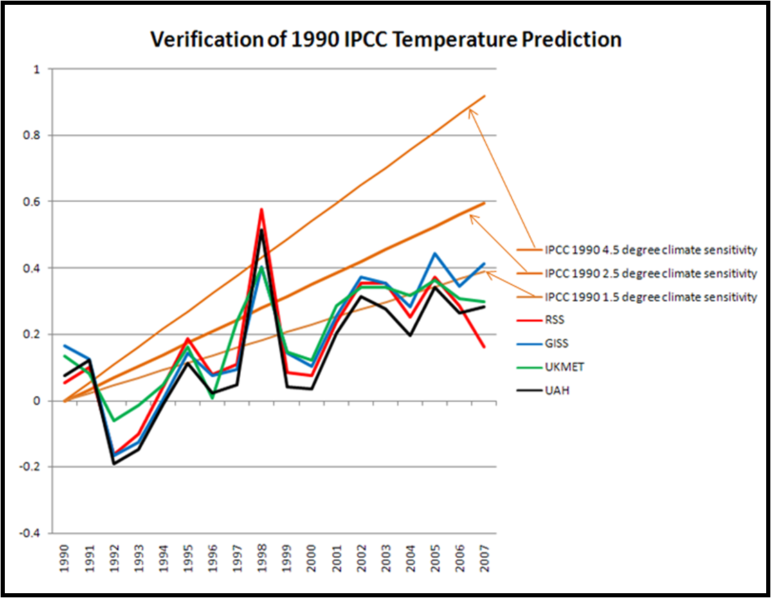
I begin with the temperature trends. I have decided to use the satellite record provided by Remote Sensing Systems, mainly because of the easy access of its data. But the choice of satellite versus surface global temperature dataset should not matter, since these have been reconciled according to the IPCC AR4. Here is a look at the satellite data starting in 1998 through 2007.

RSS TLT 1998-2007 Monthly.png

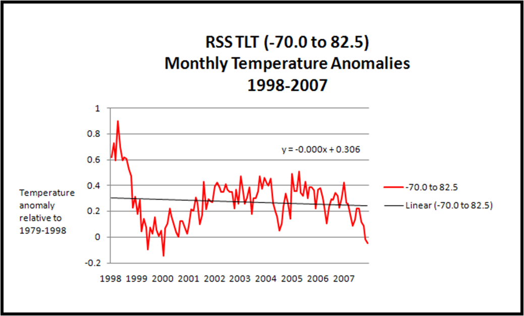
This dataset starts with the record 1997/1998 ENSO event which boosted temperatures a good deal. It is interesting to look at, but probably not the best place to start for this analysis. A better place to start is with 2000, but not because of what the climate has done, but because this is the baseline used for many of the IPCC AR4 predictions.

Before proceeding, a clarification must be made between a prediction and a projection. Some have claimed that the IPCC doesn’t make predictions, it only makes projections across a wide range of emissions scenarios. This is just a fancy way of saying that the IPCC doesn’t predict future emissions. But make no mistake, it does make conditional predictions for each scenario. Enough years have passed for us to be able to say that global emissions have been increasing at the very high end of the family of scenarios used by the IPCC (closest to A1F1 for those scoring at home). This means that we can zero in on what the IPCC predicted (yes, predicted) for the A1F1 scenario, which has best matched actual emissions.

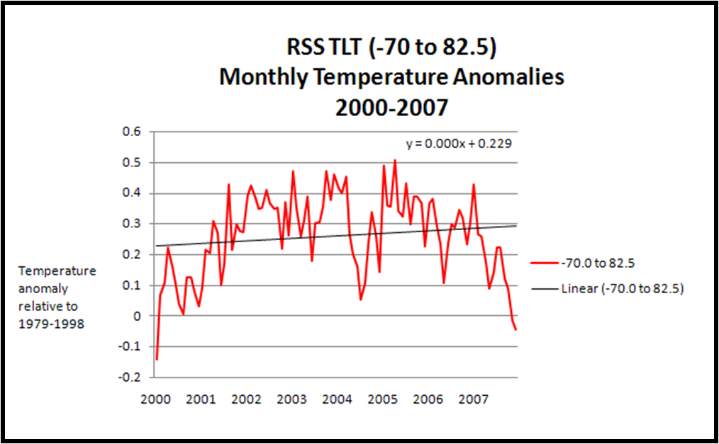
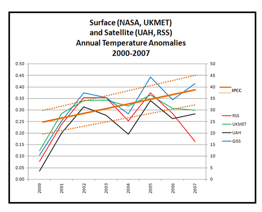
So how has global temperature changed since 2000? Here is a figure showing the monthly values, indicating that while there has been a decrease in average global temperature of late, the linear trend since 2000 is still positive.

RSS TLT 2000-2007 Monthly.png

But monthly values are noisy, and not comparable with anything produced by the IPCC, so let’s take a look at annual values.

RSS 2000-2007 Annual.png

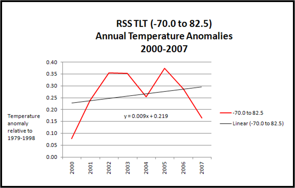
The annual values result in a curve that looks a bit like an upwards sloping letter M.

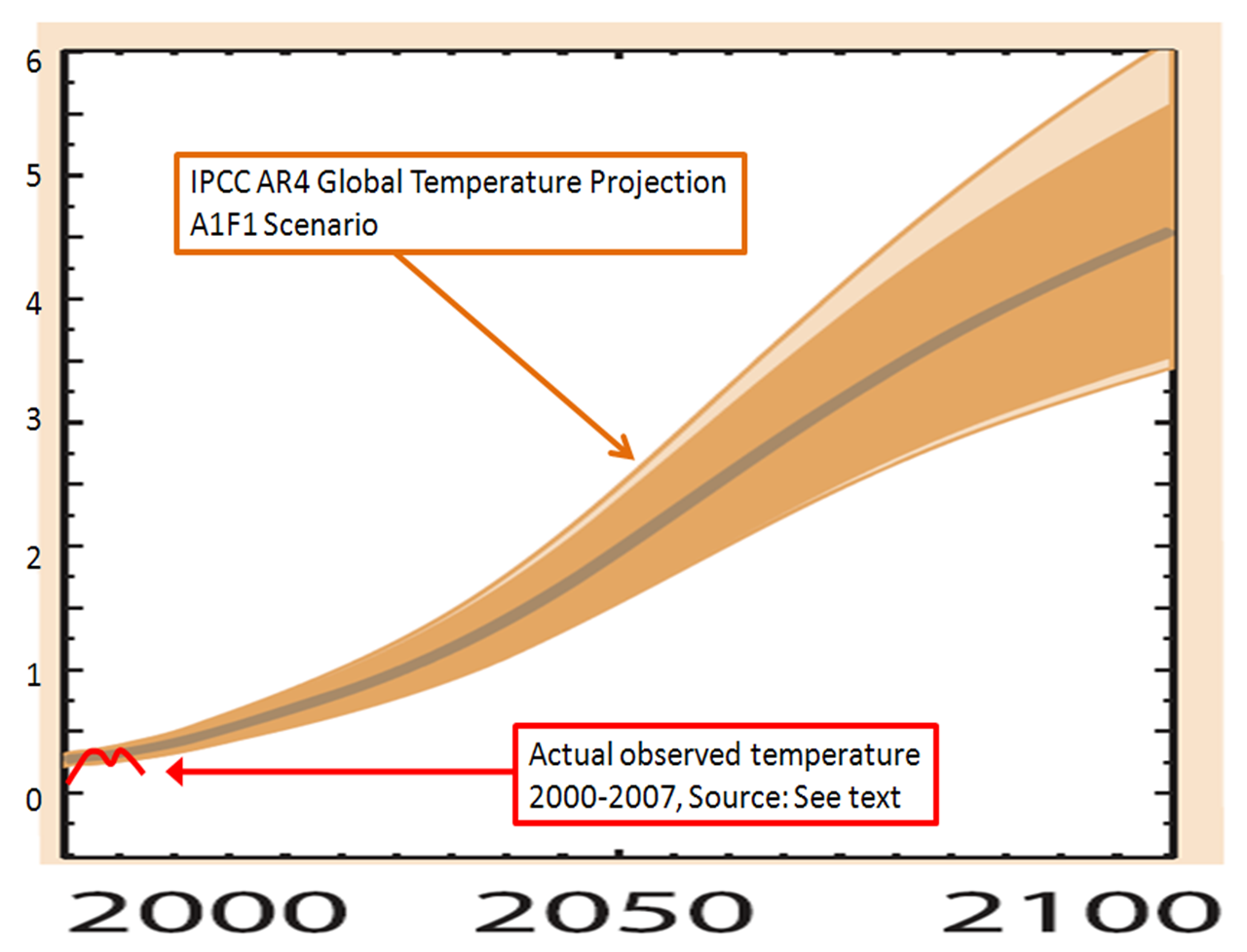
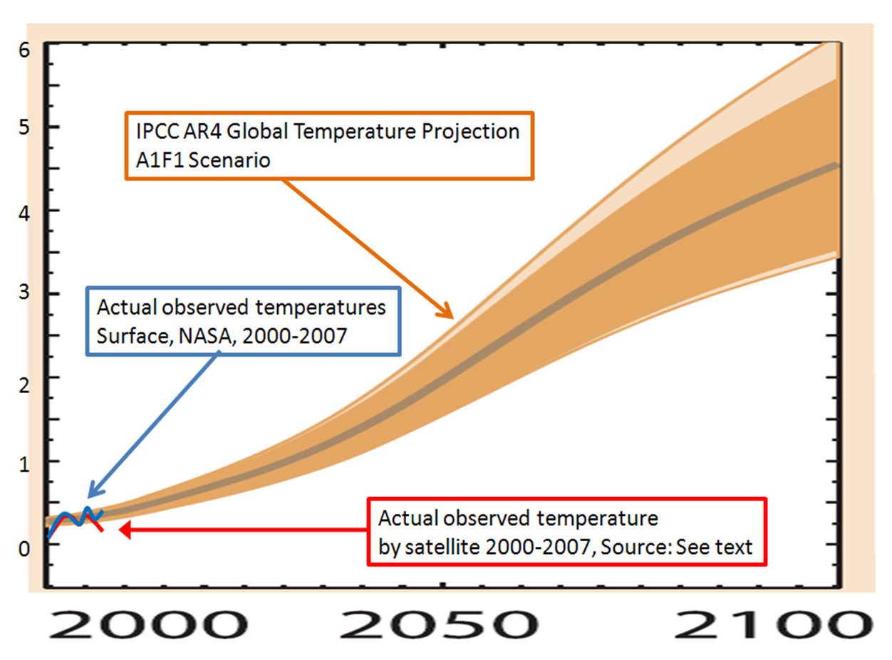
The model results produced by the IPCC are not readily available, so I will work from their figures. In the IPCC AR4 report Figure 10.26 on p. 803 of Chapter 10 of the Working Group I report (here in PDF) provides predictions of future temperature as a function of emissions scenario. The one relevant for my purposes can be found in the bottom row (degrees C above 1980-2000 mean) and second column (A1F1).

I have zoomed in on that figure, and overlaid the RSS temperature trends 2000-2007 which you can see below.

AR4 Verification Example.png

Now a few things to note:

1. The IPCC temperature increase is relative to a 1980 to 2000 mean, whereas the RSS anomalies are off of a 1979 to 1998 mean. I don’t expect the differences to be that important in this analysis, particularly given the blunt approach to the graph, but if someone wants to show otherwise, I’m all ears.

2. It should be expected that the curves are not equal in 2000. The anomaly for 2000 according to RSS is 0.08, hence the red curve begins at that value. Figure 10.26 on p. 803 of Chapter 10 of the Working Group I report actually shows observed temperatures for a few years beyond 2000, and by zooming in on the graph in the lower left hand corner of the figure one can see that 2000 was in fact below the A1B curve.

So it appears that temperature trends since 2000 are not closely following the most relevant prediction of the IPCC. Does this make recent temperature trends inconsistent with the IPCC? I have no idea, and that is not the point of this post. I’ll leave it to climate scientists to tell us the significance. I assume that many climate scientists will say that there is no significance to what has happened since 2000, and perhaps emphasize that predictions of global temperature are more certain in the longer term than shorter term. But that is not what the IPCC figure indicates. In any case, 2000-2007 may not be sufficient time for climate scientists to become concerned that their predictions are off, but I’d guess that at some point, if observations don’t match predictions they might be of some concern. Alternatively, if observations square with predictions, then this would add confidence.

Before one dismisses this exercise as an exercise in randomness, it should be observed that in other contexts scientists associated short term trends with longer-term predictions. In fact, one need look no further than the record 2007 summer melt in the Arctic which was way beyond anything predicted by the IPCC, reaching close to 3 million square miles less than the 1978-2000 mean. The summer anomaly was much greater than any of the IPCC predictions on this time scale (which can be seen in IPCC AR4 Chapter 10 Figure 10.13 on p. 771). This led many scientists to claim that because the observations were inconsistent with the models, that there should be heightened concern about climate change. Maybe so. But if one variable can be examined for its significance with respect to long-term projections, then surely others can as well.

What I’d love to see is a place where the IPCC predictions for a whole range of relevant variables are provided in quantitative fashion, and as corresponding observations come in, they can be compared with the predictions. This would allow for rigorous evaluations of both the predictions and the actual uncertainties associated with those predictions. Noted atmospheric scientist Roger Pielke, Sr. (my father, of course) has suggested that three variables be looked at: lower tropospheric warming, atmospheric water vapor content, and oceanic heat content. And I am sure there are many other variables worth looking at.

Forecast evaluations also confer another advantage – they would help to move beyond the incessant arguing about this or that latest research paper and focus on true tests of the fidelity of our ability to forecast future states of the climate system. Making predictions and them comparing them to actual events is central to the scientific method. So everyone in the climate debate, whether skeptical or certain, should welcome a focus on verification of climate forecasts. If the IPCC is indeed settled science, then forecast verifications will do nothing but reinforce that conclusion.

For further reading:

Pielke, Jr., R.A., 2003: The role of models in prediction for decision, Chapter 7, pp. 113-137 in C. Canham and W. Lauenroth (eds.), Understanding Ecosystems: The Role of Quantitative Models in Observations, Synthesis, and Prediction, Princeton University Press, Princeton, N.J. (PDF)

Sarewitz, D., R.A. Pielke, Jr., and R. Byerly, Jr., (eds.) 2000: Prediction: Science, decision making and the future of nature, Island Press, Washington, DC. (link) and final chapter (PDF).

Deja Vu All Over Again

January 7th, 2008

Posted by: Roger Pielke, Jr.

The Washington Post had a excellent story yesterday by Marc Kaufman describing NASA’s intentions to increase the flight rate of the Space Shuttle program. This is remarkable, and as good an indication as any that NASA has not yet learned the lessons of its past.

Challenger_explosion.jpg

According to the Post:

Although NASA has many new safety procedures in place as a result of the Columbia accident, the schedule has raised fears that the space agency, pressured by budgetary and political considerations, might again find itself tempting fate with the shuttles, which some say were always too high-maintenance for the real world of space flight.

A NASA official is quoted in the story:

“The schedule we’ve made is very achievable in the big scheme of things. That is, unless we get some unforeseen problems.”

The Post has exactly the right follow up to this comment:

The history of the program, however, is filled with such problems — including a rare and damaging hailstorm at the Kennedy Space Center last year as well as the shedding of foam insulation that led to the destruction of Columbia and its crew in 2003. . . “This pressure feels so familiar,” said Alex Roland, a professor at Duke University and a former NASA historian. “It was the same before the Challenger and Columbia disasters: this push to do more with a spaceship that is inherently unpredictable because it is so complex.”

John Logsdon, dean of space policy experts and longtime supporter of NASA, recognizes the risks that NASA is taking:

Every time we launch a shuttle, we risk the future of the human space flight program. The sooner we stop flying this risky vehicle, the better it is for the program.

Duke University’s Alex Roland also hit the nail on the head;

Duke professor Roland said that based on the shuttle program’s history, he sees virtually no possibility of NASA completing 13 flights by the deadline. He predicted that the agency would ultimately cut some of the launches but still declare the space station completed.

“NASA is filled with can-do people who I really admire, and they will try their best to fulfill the missions they are given,” he said. “What I worry about is when this approach comes into conflict with basically impossible demands. Something has to give.”

It is instructive to look at the 1987 report of the investigation of the House Science Committee into the 1986 Challenger disaster, which you can find online here in PDF (thanks to Rad Byerly and Ami Nacu-Schmidt). That report contains lessons that apparently have yet to be fully appreciated, even after the loss of Columbia in 2003. Here is an excerpt from the Executive Summary (emphasis added, see also pp. 119-124):

The Committee found that NASA’s drive to achieve a launch schedule of 24 flights per year created pressure throughout the agency that directly contributed to unsafe launch operations. The Committee believes that the pressure to push for an unrealistic number of flights continues to exist in some sectors of NASA and jeopardizes the promotion of a “safety first” attitude throughout the Shuttle program.

The Committee, Congress, and the Administration have played a contributing role in creating this pressure. . . NASA management and the Congress must remember the lessons learned from the Challenger accident and never again set unreasonable goals which stress the system beyond its safe functioning.

One would hope that the House Science Committee has these lessons in mind and is paying close attention to decision making in NASA. It would certainly be appropriate for some greater public oversight of NASA decision making about the Shuttle flight rate and eventual termination. Otherwise, there is a good chance that such oversight will take place after another tragedy and the complete wreckage of the U.S. civilian space program.

For further reading:

Pielke Jr., R. A., 1993: A Reappraisal of the Space Shuttle Program. Space Policy, May, 133-157. (PDF)

Pielke Jr., R.A., and R. Byerly Jr., 1992: The Space Shuttle Program: Performance versus Promise in Space Policy Alternatives, edited by R. Byerly, Westview Press, Boulder, pp. 223-245. (PDF)

My Comments to Science on Hillary Clinton’s Science Policy Plans

January 5th, 2008

Posted by: Roger Pielke, Jr.

I was recently asked by Eli Kintisch at Science to comment on Hillary Clinton’s recent discussion of science policies. Eli quotes a few of my comments in this week’s Science, which has a special focus on the presidential candidates. My full reaction to Eli is below:

Hi Eli-

The document seems typical for this early stage of the campaign — that is, it blends a heavy dose of political red meat, with the entirely vacuous, with hints of some innovative and perhaps even revolutionary new ideas, accompanied with a range of budget promises that almost certainly can’t be met. But most significantly is the fact that she has put some science policy ideas forward to be discussed, which is far more than most other candidates of either party have done related to science.

*The red meat is all of the “I’m not George Bush” type statements, such as the stem cell proposal and re-elevation of the science advisor position.

*The vacuous includes the comment that you starred on political appointees. The meaning of this statement depends entirely on the definition of “legitimate basis” and “unwarranted supression” — well, what is “legitimate” and “unwarranted”? — as written it is a political Rorschach test, which can be good politics but certainly does nothing to clarify the specific science policies she would enact. Also, the idea that civil servants and scientists are free from politics in regulatory decision making probably needs more thinking through — but balancing accountability and expertise probably requires more wonky discussion than a campaign sound bite can provide.

*The most innovative idea is the $50 billion strategic energy fund, which is short on details, but promises real money to an area desperately in need of support. This stands out as something really new and potentially very exciting.

*The promises that probably can’t be met include keeping the Shuttle contractors in business while pursuing a new human spaceflight program, while at the same time fully funding earth sciences research and a new space-based climate research program, while putting NIH on a doubling trajectory over the next 10 years, not to mention a bit for aeronautics and the $50 billion for energy research. Good luck finding room in the R&D budget for all of that. But again, more politics than science policy, this time aimed at more specific constituencies looking to see that their concerns get some play.

The biggest criticism I have is the comment about the NIH budget, which her husband set on a doubling trajectory and which was completed under Bush. To suggest that NIH has suffered a lack of support is not a great argument. Also, a minor criticism, the part about the U.S. national assessment on climate change says that Bush hasn’t released one for 6.5 years, but Clinton/Gore took more than 7 years to release theirs. The national assessment is more political red meat, and probably tangential to where the action is on climate issues anyway.

Hope this helps, please follow up if clarification is needed . . .

Best regards,

Roger

Roger Pielke, Jr.
University of Colorado

Technology ,Trade, and U.S. Pollution

January 2nd, 2008

Posted by: Roger Pielke, Jr.

At the Vox blog Georgetown’s Arik Levinson asks:

Since the 1970s, US manufacturing output has risen by 70% but air pollution has fallen by 58%. Was this due to improved abatement technology or shifting dirty production abroad?

He answers the question with some very nice empirical research. Here are his conclusions:

What is the bottom line? Increased net imports of polluting goods account for about 70 percent of the composition-related decline in US manufacturing pollution. The composition effect in turn explains about 40 percent of the overall decline in pollution from US manufacturing. Putting these two findings together, international trade can explain at most 28 percent of the clean-up of US manufacturing.

levinson_fig.JPG

Why should we care?

If the 75% reduction in pollution from US manufacturing resulted from increased international trade, the pundits and protestors might have a case. Environmental improvements might be said to have imposed large, unmeasured environmental costs on the countries from which those goods are imported. And more importantly, the improvements in the US would not be replicable by all countries indefinitely, because the poorest countries in the world will never have even poorer countries from which to import their pollution-intensive goods. The US clean-up would simply have been the result of the US coming out ahead in an environmental zero-sum game, merely shifting pollution to different locations. However, if the US pollution reductions come from technology, nothing suggests those improvements cannot continue indefinitely and be repeated around the world. The analyses here suggest that most the pollution reductions have come from improved technology, that the environmental concerns of antiglobalization protesters have been overblown, and that the pollution reduction achieved by US manufacturing will replicable by other countries in the future.

Natural Disasters in Australia

January 2nd, 2008

Posted by: Roger Pielke, Jr.

Here (in PDF) is an interesting analysis by researchers at Macquarie University in Australia:

The collective evidence reviewed above suggests that social factors – dwelling numbers and values – are the predominant reasons for increasing building losses due to natural disasters in Australia. The role of anthropogenic climate change is not detectable at this time. This being the case, it seems logical approach that in addition to reducing greenhouse gas emissions, equivalent investments be made to reduce society’s vulnerability to current and future climate and climate variability.

australia.png

We are aware of few policies explicitly developed to help Australian communities adapt to future climate change (Leigh et al., 1998). One positive example is improved wind loading codes introduced in the 1980s as part of a National Building Code of Australia. These codes have been mentioned already and were introduced for all new housing construction following the destruction of Darwin by Tropical Cyclone Tracy in 1974. As a result, dramatic reductions in wind-induced losses were observed following Tropical Cyclones Winifred (1986) and Aivu (1989) (Walker, 1999) and most recently, Larry (2006) (Guy Carpenter, 2006). While these measures were introduced in response to the immediate threat from current climatic events, the benefits will hold true under any future.

An increased threat from bushfires under global climate change is often assumed. However, our analyses suggest that while the prevalence of conditions leading to bushfires is likely to increase, the impact is unlikely to be as dramatic as the combined changes of all of the other factors that have so far failed to materially affect the likelihood of bushfires losses over the last century. This is not to ignore the threat posed by global climate change, but, at least in the case of fire in Australia, the main menace will continue to be the extreme fires. The threat to the most at-risk homes on the bushland-urban interface can only be diminished by improved planning regulations that restrict where and how people build with respect to distance from the forest. Again these are political choices.

Is there any weather inconsistent with the the scientific consensus on climate?

January 1st, 2008

Posted by: Roger Pielke, Jr.

Two years ago I asked a question of climate scientists that never received a good answer. Over at the TierneyLab at the New York Times, John Tierney raises the question again:

What behavior of the climate system could hypothetically be observed over the next 1, 5, 10 years that would be inconsistent with the current consensus on climate change? My focus is on extreme events like floods and hurricanes, so please consider those, but consider any other climate metric or phenomena you think important as well for answering this question. Ideally, a response would focus on more than just sea level rise and global average temperature, but if these are the only metrics that are relevant here that too would be very interesting to know.

The answer, it seems, is “nothing would be inconsistent,” but I am open to being educated. Climate scientists especially invited to weigh in in the comments or via email, here or at the TierneyLab.

And a Happy 2008 to all our readers!